REVIEW 4 major objections 6 minor 18 references
Visual cues in estimation of part-to-whole comparison
T0 review · 4 major / 6 minor · reviewed 2026-08-14 · deepseek-v4-flash
Pith's one-line read The paper reports that for part-to-whole comparisons, baseline pie charts yield lower mean absolute estimation error than horizontal bar charts, and that adding decile cues to bars improves accuracy, concluding that data visualization…
desk verdict A modest, plausible MTurk study that extends the pie-vs-bar debate with visual cues, but the statistical support is weaker than the paper claims and a table count doesn't add up. read the letter →
The pith
A machine-rendered reading of the paper's core claim, the machinery that carries it, and where it could break.
The reading
What carries the argument
The central mechanism is the perceptual anchor: the angles 0°, 90°, and 180° in a pie provide natural reference points that participants use when judging segment size, giving pies an advantage over bars, which only offer start and end anchors. The experiments operationalize this by comparing baseline charts with variants that add visual cues—quartile lines, decile lines, and an external quantitative scale—and measuring mean absolute error across 1,415 valid responses after Tukey-fence outlier removal. The load-bearing identity is the claimed significant difference established by non-overlapping 95% confidence intervals, following Cumming.
What would settle it
Re-analyze the paper's mean absolute error data with a proper inferential test—a two-sample t-test or permutation test on the per-impression errors for baseline pie versus baseline bar. If the resulting p-value is not below 0.05, the central claim that pies are significantly better than bars collapses. Also, check whether the confidence intervals were computed on per-task means rather than per-impression responses; using the wrong unit of analysis would invalidate the non-overlap claim.
Extended reading notes
Core claim
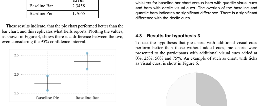
On its own terms, the paper's central discovery is that the baseline pie chart outperforms the baseline horizontal bar chart for estimating segment size in part-to-whole charts: mean absolute error 1.7665 for pie versus 2.3458 for bar, with the paper treating non-overlap of 95% confidence intervals as significant. A secondary result is that decile cues on bars and a quantitative scale on bars both improve estimation, while quartile cues on pies do not significantly change performance. The author states that these findings replicate Eells (1926) and support the position that pie charts have naturally occurring perceptual anchors at 0%, 25%, 50%, 75%, and 100%.
Load-bearing premise
The paper assumes that non-overlap of 95% confidence intervals is a valid significance test; if that assumption fails, the claimed differences between pie and bar charts, and the benefit of decile cues and scales, are not statistically established.
Editorial extensions
If this is right
- Pie charts are not a mistake for part-to-whole comparisons: the baseline pie beat the baseline bar in this study.
- Bar charts improve when given more granular internal anchors: decile cues significantly reduced error over baseline.
- A quantitative scale is the best cue for bars, but when a scale is inappropriate, decile lines are a viable alternative.
- Adding quartile cues to pies does not significantly help, consistent with pies already carrying quarter anchors.
- Data visualization professionals can adopt pies or bars-with-cues without violating accuracy goals.
Reading between the lines
- The paper's significance claim rests solely on non-overlap of confidence intervals; a reanalysis with formal hypothesis tests (permutation or t-tests) could either support or overturn the pie-over-bar conclusion, so the practical recommendation should be treated as provisional.
- If natural anchors are the true explanation, then pies with cues at non-standard angles (e.g., every 30°) should improve accuracy, a testable prediction the paper does not run.
- Because the participant pool was Amazon Mechanical Turk workers with no cohort selection, the results may not transfer to expert analysts or high-stakes settings; a replication with domain experts would test that boundary.
- The relative advantage of pies may shrink when the target segment is far from the natural anchors—e.g., near 33% or 44%—and a per-value breakdown could reveal where bars and pies cross over.
Signed reviews
Editorial analysis
A structured set of objections, weighed in public.
Referee Report
Summary. The manuscript reports a crowdsourced experiment (316 Amazon Mechanical Turk workers, 1,415 responses after Tukey-fence outlier removal) in which participants estimate the percentage of a highlighted segment in pie charts and horizontal stacked-bar charts, with variants adding quartile lines, decile lines, an external scale, and quartile ticks on pies. The author compares mean absolute error (MAE) across conditions, concludes that baseline pie charts yield lower MAE than baseline bar charts, that decile cues on bars and an external scale improve accuracy, and that the study does not substantiate the claim that bar charts are preferable to pies. The conclusion advises visualization practitioners that using a pie chart for part-to-whole comparison is not an error.
Significance. If validated, the result would provide a useful replication of earlier empirical findings (Eells; Spence and Lewandowsky; Kosara) using modern crowdsourced data and would inform practical recommendations for visualization design. The paper's strengths are its simple, concrete estimation task, its use of mean absolute error, and its transparent description of the outlier-removal procedure. However, the central claims are not currently supported by the reported statistical analysis: inference is based on visual overlap of unreported confidence intervals computed on non-independent observations, and the paper contains an internal count inconsistency. The conclusions therefore cannot be accepted as stated without a re-analysis of the data.
major comments (4)
- [Section 4.1 and Figures 3, 5, 7, 9] The central significance claims—that the pie chart performed better than the bar chart and that decile or scale cues significantly reduce error—rest entirely on visual comparisons of 95% confidence intervals, but the manuscript reports neither the interval widths, standard errors, nor the method used to compute them. Moreover, the observations are not independent: 316 workers produced 1,415 impressions, with some workers seeing up to 25 charts. Per-impression confidence intervals ignore this clustering and are likely too narrow, so the reported lack of overlap cannot be taken as evidence of a reliable difference. The author should report a mixed-effects model or a participant-level analysis with formal tests and effect sizes, and provide the raw data or sufficient summary statistics for verification.
- [Sections 4.3 and 4.4] The paper uses confidence-interval overlap both as evidence of significance and as evidence of no effect. In Section 4.3, the conclusion that the quartile-cue hypothesis 'can be rejected' is based solely on overlapping intervals, and in Section 4.4 a similar interval comparison is used to claim that 'the hypothesis cannot be rejected.' Non-overlap of 95% confidence intervals is a sufficient but not necessary condition for a significant difference at the 0.05 level; overlap does not imply equivalence or absence of a difference. Rejection of the hypothesis of no improvement requires an equivalence test, a non-inferiority test, or a properly powered null result with reported confidence bounds.
- [Table 1 and Section 3] The row counts in Table 1 sum to 1,425, not the 1,415 'valid responses' stated in Section 3 and in the table caption. This discrepancy must be resolved before any conclusions can be checked, because the reported means and confidence intervals depend on the exact per-cell counts. The author should correct the counts or the text and explain which number was actually used in the analysis.
- [Sections 4.1-4.4] The study tests four hypotheses and makes multiple pairwise comparisons across chart types and cue conditions without any adjustment for multiple comparisons or a full account of all conducted tests. Given the number of comparisons shown in Figures 5 and 9, the probability of at least one false positive is inflated. The author should apply a suitable correction (for example, Tukey HSD, Bonferroni, or pre-specified contrasts) or explicitly state that these comparisons are exploratory.
minor comments (6)
- [Figure 9 caption] The caption refers to 'baseline bar chart and baseline pie chart,' but the text then discusses the bar with scale; the caption should be rewritten to describe the conditions actually plotted.
- [Figure 3 caption] The name 'Cummings' should be 'Cumming,' matching reference [18].
- [Section 4.3] There are typographical errors: 'platted' should be 'plotted,' and 'the different is not significant' should be 'the difference is not significant.'
- [Section 4.4] The sentence 'The significance of the difference in mean absolute error that the hypothesis cannot be rejected' is grammatically incomplete; please rephrase it.
- [References [7] and [10]] The author's name is spelled 'Spence,' not 'Spense,' in references [7] and [10].
- [General] The manuscript does not include a data availability statement; sharing the de-identified response data would support the re-analysis required by the major comments.
Circularity Check
No significant circularity: the paper is an empirical comparison with no fitted parameters or derivation chain that reduces to its inputs.
full rationale
This paper reports a crowdsourced empirical study comparing mean absolute estimation errors across pie and bar chart variants. There is no mathematical derivation, no model fitted to a subset of the data and then used to predict a closely related quantity, and no load-bearing self-citation invoked to establish a premise. The conclusions follow directly from measured error values and confidence-interval comparisons, with the external citation to Cumming's 'New Statistics' serving only as a statistical rule of thumb for interpreting interval overlap. Any concerns about the validity of using confidence-interval overlap as a significance test, or about repeated-measures clustering, are statistical correctness issues rather than circularity. The paper does not define its outcome in terms of its inputs, nor does it rename a known result as a prediction. Therefore the appropriate circularity score is 0.
Assumptions & free parameters
assumptions (4)
- domain assumption Mechanical Turk participants provide reliable enough estimates for drawing conclusions about chart perception.
- domain assumption Tukey Fences outlier removal with k=1.5 does not bias comparisons.
- domain assumption Non-overlap of 95% confidence intervals is a sufficient significance test.
- domain assumption Two-segment charts with a dark and light segment capture the relevant part-to-whole comparison task.
Cite this review
Pith. "Pith review of Visual cues in estimation of part-to-whole comparison." pith.science (2026). https://pith.science/paper/IRF5S2CJ
@misc{pith2026190800630,
  author       = {Pith},
  title        = {Pith review of: Visual cues in estimation of part-to-whole comparison},
  year         = {2026},
  howpublished = {\url{https://pith.science/paper/IRF5S2CJ}},
  note         = {Machine review of arXiv:1908.00630}
}
read the original abstract
Pie charts were first published in 1801 by William Playfair and have caused some controversy since. Despite the suggestions of many experts against their use, several empirical studies have shown that pie charts are at least as good as alternatives. From Brinton to Few on one side and Eells to Kosara on the other, there appears to have been a hundred-year war waged on the humble pie. In this paper a set of experiments are reported that compare the performance of pie charts and horizontal bar charts with various visual cues. Amazon's Mechanical Turk service was employed to perform the tasks of estimating segments in various part-to-whole charts. The results lead to recommendations for data visualization professionals in developing dashboards.
Figures


Figures from the paper (3 more)


Reference graph
Works this paper leans on
-
[1]
W. Playfair, The Statistical Breviary: Shewing, on a Principle Entirely New, the Resources o f Every State and Kingdom in Europe; Illustrated with Stained Copper-plate Charts the Physical Powers of Each Distinct Nation with Ease and Perspicuity: to which is Added, a Si, London: T. Bensley, Bolt Court, Fleet Street, 1801
-
[2]
Joint committee on standards for graphic presentation,
W. C. Brinton, L. P. Ayres, N. A. Carle, R. E. Chaddock, F. A. Cleveland, H. E. Crampton, W. S. Gifford, J. A. Harris, H. E. Hawkes, J. A. Hill, H. D. Hubbard, R. H. Montgomery, H. H. Norris, A. Smith, J. Stewart, W. M. Strong and E. L. Thorndike, "Joint committee on standards for graphic presentation," Publications of the American Statistical Association...
work page 1915
-
[3]
W. C. Brinton, Graphic presentation, New York: Brinton Associates, 1939
work page 1939
-
[4]
E. R. Tufte, The Visual Display of Quantitative Information, Cheshire, CT: Graphics Press, 1983
work page 1983
-
[5]
S. Few, "Save the Pies for Dessert," Visual Business Intelligence Newsletter, pp. 1-14, August 2007
work page 2007
-
[6]
The Relative Merits of Circles and Bars for Representing Component Parts,
W. C. Eells, "The Relative Merits of Circles and Bars for Representing Component Parts," Journal of the American Statistical Association, vol. 21, pp. 119-132, 1926
work page 1926
-
[7]
Displaying propo rtions and percentages,
I. Spense and S. Lewandowsky, "Displaying propo rtions and percentages," Applied Cognitive Psychology, vol. 5, pp. 61-77, 1991
work page 1991
-
[8]
Arcs, Angles, or Areas: Individual Data Encodings in Pie and Donut Charts,
D. Skau and R. Kosara, "Arcs, Angles, or Areas: Individual Data Encodings in Pie and Donut Charts," Computer Graphics Forum, vol. 35, pp. 121-130, 2016
work page 2016
Show all 18 references
-
[9]
An Information -Processing Analysis of Graph Perception,
D. Simkin and R. Hastie, "An Information -Processing Analysis of Graph Perception," Journal of th e American Statistical Association, vol. 82, pp. 454-465, 1987
1987
-
[10]
No humble pie: The origins and usage of a statistical chart,
I. Spense, "No humble pie: The origins and usage of a statistical chart," Journal of Educational and Behavioral Statistics, vol. 30, pp. 353-368, 2005
2005
-
[11]
Circular Part-to-Whole Charts Using the Area Visual Cue,
R. Kosara, "Circular Part-to-Whole Charts Using the Area Visual Cue," in 21st Eurographics Conference on Visualization, EuroVis 2019 - Short Papers , Porto, Portugal, 2019
2019
-
[12]
The Impact of Distribution and Chart Type on Part-to-Whole Comparisons,
R. Kosara, "The Impact of Distribution and Chart Type on Part-to-Whole Comparisons," in 21st Eurogra phics Conference on Visualization, EuroVis 2019 - Short Papers, Porto, Portugal, 2019
2019
-
[13]
An empire built on sand: Reexamining what we think we know about visualization,
R. Kosara, "An empire built on sand: Reexamining what we think we know about visualization," in Proceedings of the Sixth Workshop on Beyond Time and Errors on No vel Evaluation Methods for Visualization, 2016
2016
-
[14]
Crowdsourcing graphical perception: using mechanical turk to assess visualization design,
J. Heer and M. Bostock, "Crowdsourcing graphical perception: using mechanical turk to assess visualization design," in Proceedings of the SIGCHI conference on human factors in computing systems, 2010
2010
-
[15]
J. W. Tukey, Exploratory data analysis, Addison -Wesley, 1977
1977
-
[16]
Graphical perception and graphical methods for analyzing scientific data,
W. S. Cleveland and R. McGill, "Graphical perception and graphical methods for analyzing scientific data," Science, vol. 229, pp. 828-833, 1985
1985
-
[17]
Judgment Error in Pie Chart,
R. Kosara and D. Skau, "Judgment Error in Pie Chart," in EuroVis 2016 - Short Papers, 2016
2016
-
[18]
The New Statistics: Why and How,
G. Cumming, "The New Statistics: Why and How," Psychological Science, vol. 25, no. 1, pp. 7-29, 2014
2014
Reviewed August 14, 2026 · model on record in the stance chip above.
Discussion (0). Continue with ORCID to comment.