REVIEW 2 major objections 6 minor 46 references
Interactive Visualisation of Hierarchical Quantitative Data: An Evaluation
T0 review · 2 major / 6 minor · reviewed 2026-08-14 · deepseek-v4-flash
Pith's one-line read Treemaps trail icicle and sundown charts in user study
desk verdict Solid speed and preference results for a useful three-way comparison, but the accuracy claim in the abstract is overstated. read the letter →
The pith
A machine-rendered reading of the paper's core claim, the machinery that carries it, and where it could break.
The reading
What carries the argument
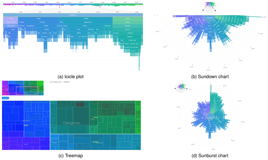
The argument is carried by an interaction framework held constant across visualisations: an overview plus detail view, zoom-in-place navigation, a breadcrumb trail, dynamic labels, a value scale, and unit visualisation, meaning every node is shown rather than aggregated. The sundown chart is the newly proposed object, a semicircular sunburst with the root at the centre and children fanning outward, encoding quantity by arc angle and fitting 16:9 displays better than a full circle. Because the interaction design is the same everywhere, the measured differences are attributed to the visual encodings themselves rather than to navigation features.
What would settle it
Run the same four tasks with the same interaction framework on a real-world hierarchy with a skewed value distribution, such as a disk-usage tree where a few large files dominate, and compare treemap with icicle and sundown charts; if treemap is no longer slower or less accurate, the paper's ordering is specific to the random-value dataset.
Extended reading notes
Core claim
On the paper's own terms, the central discovery is that for interactive hierarchies with quantitative values, treemaps are measurably worse than icicle plots and sundown charts. With 12 participants, the treemap was significantly slower on a basic navigation task, averaging 53.0 seconds versus 32.6 seconds for the icicle plot and 35.2 seconds for the sundown chart; it was also significantly slower on a closest-relationship task, averaging 44.2 seconds versus 20.0 and 20.6 seconds, slower on a least-common-ancestor task, and less accurate on the relationship task, 91.4 percent versus 97.2 percent for both alternatives. Users ranked the treemap lowest for aesthetics, usability, and overall preference. The paper finds no support for the suspected trade-off between hierarchy-friendly and quantity-friendly designs: icicle plots and sundown charts handle both kinds of tasks well.
Load-bearing premise
The result rests on the assumption that a single hierarchy with randomly assigned leaf values behaves like real-world hierarchical quantitative data; the paper itself notes that real datasets may have different shapes and value distributions.
Editorial extensions
If this is right
- Designers of tools for hierarchical quantitative data have a reason to offer icicle plots or sundown charts alongside, or instead of, treemaps when users must navigate and understand tree structure.
- The sundown chart provides a radial encoding competitive with the linear icicle plot while avoiding the large white-space cost of a full 360-degree sunburst on wide screens.
- The absence of a hierarchy-versus-quantity trade-off suggests that one-dimensional encodings such as length or angle can support both structural and value-comparison tasks at once.
- The WebGL-and-D3 hybrid implementation shows that these non-treemap encodings remain responsive for hierarchies with more than 50,000 nodes, removing a scale barrier that earlier evaluations had.
Reading between the lines
- We extrapolate that the treemap's disadvantage may depend on the squarified layout chosen here; a different treemap layout with less extreme aspect ratios could narrow the gap, since the paper does not vary layout strategies within visualisation type.
- The motion-sickness reports for the sundown chart suggest a testable follow-up: measuring disorientation over longer sessions could reveal whether its semicircular geometry trades comfort for screen fit.
- Because the leaf values were assigned randomly, we infer that the ordering is most secure for hierarchies with roughly uniform leaf values; a natural extension is to re-run the same four tasks on real-world distributions such as disk usage, where a few large leaves dominate.
- The similar performance of the two one-dimensional encodings predicts that other length-based hierarchy views, such as flame graphs, will also beat treemaps on navigation and hierarchy-understanding tasks.
Signed reviews
Editorial analysis
A structured set of objections, weighed in public.
Referee Report
Summary. The paper reports two user studies comparing treemaps, icicle plots, sunburst charts, and a new semicircular 'sundown' variant for interactive hierarchical quantitative data. After a six-participant pilot in which sunburst was least preferred, a controlled within-subject study with twelve participants compared icicle plot, sundown chart, and treemap on four tasks (navigation, size comparison, relationship identification, least common ancestor), measuring time, accuracy, and preference. The main reported findings are that treemap was significantly slower on Q1, Q3, and Q4, least preferred, and, according to the abstract and conclusion, less accurate on hierarchy-understanding tasks, while icicle and sundown performed similarly. The paper also contributes a consistent overview+detail interaction framework and an open-source WebGL/D3 implementation.
Significance. If the results hold, the paper provides a useful, methodologically more controlled comparison than earlier work, with a consistent interaction design across conditions, a larger hierarchy than most prior studies, and an open-source implementation that supports reproducibility via the linked repository and deployed demo. The speed and preference findings for treemap are clearly supported by the reported statistics. The accuracy claim is not supported at conventional levels, so the headline contribution needs to be narrowed. The sundown chart is a modest design variant rather than a radically new technique, but its inclusion is reasonable for the comparison.
major comments (2)
- [Abstract; §5 Conclusion] The abstract and conclusion claim that the treemap had 'slower performance and accuracy in hierarchy understanding tasks.' The accuracy component is not supported by the reported statistics. In §4.3, the only accuracy result with a significant omnibus Friedman test is Q3 (chi-square(2)=6, p=.0498), and the post-hoc pairwise comparisons between treemap and either alternative are p=.0855. Q1, Q2, and Q4 accuracy show no significant effect. This is load-bearing because the abstract presents speed and accuracy together as the core result. Please rephrase to state that the treemap was significantly slower and showed a nonsignificant trend toward lower accuracy on Q3, and report the exact p values in the abstract or conclusion.
- [§4.2; §5] The study's external validity rests on the randomized quantitative leaf values assigned to the CHI Browse-Off hierarchy. As the authors acknowledge in §5, this may be unrepresentative of real-world datasets. Because Q2 (size comparison) and Q3 (relationship identification) depend on the value distribution, a different distribution (e.g., skewed values or values correlated with hierarchy depth) could change the ordering of visualisations. This is not an internal inconsistency, but it is a correctness-risk concern. The paper should temper the generalised conclusions and specify a concrete replication direction, such as using real value distributions from disk-usage or budget data, rather than presenting the randomized-data version as the primary evidence.
minor comments (6)
- [§4.2] The random quantitative value assignment is not fully specified: the distribution, range, and whether internal node values are computed as sums of children are not stated, which makes the study difficult to reproduce exactly.
- [§4.3] The sentence 'Answers were not normally distributed' is imprecise for binary accuracy data; the Friedman test is appropriate for ordinal/binary repeated measures, but the wording suggests a normality assumption that does not apply.
- [Figure 2] The caption says '95% confidence interval of time' but does not indicate whether the intervals are adjusted for the within-subject design; please clarify the calculation method in the caption or methods.
- [§3 Implementation] The claim that the hybrid WebGL/D3 implementation supports smooth interaction with more than 50,000 nodes is not evaluated in the user study, so it should be presented as a technical benchmark rather than as part of the empirical comparison.
- [§1 Introduction; §5 Conclusion] There is a typo in the introduction's summary of results: 'leading to slower performance task accuracy' should read 'leading to slower performance and lower task accuracy'.
- [§5 Conclusion] The sample size of twelve participants, though common in controlled visualization studies, is small; a sentence acknowledging the limited statistical power for detecting small accuracy differences would help calibrate the conclusions.
Circularity Check
No circularity: empirical user study compares visualizations using measured task time, accuracy, and preferences; no fitted input is renamed as a prediction.
full rationale
This paper is an empirical user study rather than a derivation. All central claims are summaries of logged task completion times, binary accuracy scores, and preference rankings from 12 participants in a controlled experiment, analyzed with Friedman tests and linear mixed models. No parameter is fitted to a subset of the data and then renamed as a prediction, and no theoretical result is derived from an assumption that already contains the conclusion. The sundown chart is a novel design, but its evaluation is comparative and data-driven: the observed treemap disadvantages come from measured performance differences, not from the way treemaps or the other charts were defined. The acknowledged limitation about randomized quantitative leaf values concerns external validity, and the borderline Q3 accuracy post-hoc result (p = .0855) concerns statistical strength and reporting accuracy, not circular dependency. Self-citations and prior-work citations are used only for motivation or design choices, not as load-bearing evidence for the empirical outcome. Therefore no circular step can be exhibited, and the appropriate score is 0.
Assumptions & free parameters
assumptions (2)
- domain assumption The CHI Browse-Off dataset with random leaf values is representative of real-world hierarchical quantitative datasets.
- domain assumption The four task types (navigation, size comparison, relationship identification, least common ancestor) capture the relevant user tasks for hierarchical quantitative data.
invented entities (1)
-
Sundown chart
Cite this review
Pith. "Pith review of Interactive Visualisation of Hierarchical Quantitative Data: An Evaluation." pith.science (2026). https://pith.science/paper/UZAJSKAZ
@misc{pith2026190801277,
  author       = {Pith},
  title        = {Pith review of: Interactive Visualisation of Hierarchical Quantitative Data: An Evaluation},
  year         = {2026},
  howpublished = {\url{https://pith.science/paper/UZAJSKAZ}},
  note         = {Machine review of arXiv:1908.01277}
}
read the original abstract
We have compared three common visualisations for hierarchical quantitative data, treemaps, icicle plots and sunburst charts as well as a semicircular variant of sunburst charts we call the sundown chart. In a pilot study, we found that the sunburst chart was least preferred. In a controlled study with 12 participants, we compared treemaps, icicle plots and sundown charts. Treemap was the least preferred and had a slower performance on a basic navigation task and slower performance and accuracy in hierarchy understanding tasks. The icicle plot and sundown chart had similar performance with slight user preference for the icicle plot.
Figures

Reference graph
Works this paper leans on
-
[1]
https://philogb.github.io/jit/index.html, 2013
JavaScript InfoVis Toolkit. https://philogb.github.io/jit/index.html, 2013
work page 2013
-
[2]
R. Amar and J. Stasko. A Knowledge Task-Based Framework for De- sign and Evaluation of Information Visualizations. InIEEE Symposium on Information Visualization, pages 143–150, 2004
work page 2004
-
[3]
K. Andrews and H. Heidegger. Information Slices: Visualising and Exploring Large Hierarchies Using Cascading, Semi-Circular Discs. In IEEE Symposium on Information Visualization , pages 9–11, 1998
work page 1998
-
[4]
T. Barlow and P. Neville. A comparison of 2-D visualizations of hierarchies. In IEEE Symposium on Information Visualization, 2001. INFOVIS 2001., pages 131–138, Oct. 2001
work page 2001
- [5]
-
[6]
B. B. Bederson, B. Shneiderman, and M. Wattenberg. Ordered and Quantum Treemaps: Making Effective Use of 2D Space to Display Hierarchies. In The Craft of Information Visualization, Interactive Tech- nologies, pages 257–278. Morgan Kaufmann, San Francisco, 2003
work page 2003
-
[7]
R. Blanch and E. Lecolinet. Browsing Zoomable Treemaps: Structure- Aware Multi-Scale Navigation Techniques. IEEE transactions on visualization and computer graphics , 13:1248–53, Nov. 2007
work page 2007
- [8]
Show all 46 references
-
[9]
Chintalapani, C
G. Chintalapani, C. Plaisant, and B. Shneiderman. Extending the utility of treemaps with flexible hierarchy. In Proceedings. Eighth International Conference on Information Visualisation, 2004. IV 2004. , pages 335–344, July 2004
2004
-
[10]
M. C. Chuah. Dynamic aggregation with circular visual designs. In Proceedings IEEE Symposium on Information Visualization (Cat. No.98TB100258), pages 35–43, 151, Oct. 1998
1998
-
[11]
W. S. Cleveland and R. McGill. Graphical Perception: Theory, Experi- mentation, and Application to the Development of Graphical Methods. Journal of the American Statistical Association , 79(387):531–554, 1984
1984
-
[12]
DaisyDisk
DaisyDisk. DaisyDisk. https://daisydiskapp.com/, May 2018
2018
-
[13]
G. M. Draper and R. F. Riesenfeld. Interactive fan charts: A space- saving technique for genealogical graph exploration. In Proceedings of the 8th Annual Workshop on Technology for Family History and Genealogical Research (FHTW 2008), 2008
2008
-
[14]
Drucker and R
S. Drucker and R. Fernandez. A Unifying Framework for Animated and Interactive Unit Visualizations. Microsoft Research, Aug. 2015
2015
-
[15]
Elmqvist and J
N. Elmqvist and J. D. Fekete. Hierarchical Aggregation for Information Visualization: Overview, Techniques, and Design Guidelines. IEEE Transactions on Visualization and Computer Graphics, 16(3):439–454, May 2010
2010
-
[16]
Fekete and C
J.-D. Fekete and C. Plaisant. Interactive Information Visualization of a Million Items. In IEEE Symposium on Information Visualization , pages 117–124, Oct 2002
2002
-
[17]
Field, J
A. Field, J. Miles, and Z. Field. Discovering statistics using R . Sage publications, 2012
2012
-
[18]
P. A. G. Garc´ıa, David Mart´ın-Moncunill, Salvador S´anchez-Alonso, and Ana Fermoso Garc´ıa. A usability study of taxonomy visualisation user interfaces in digital repositories. Online Information Review , 38(2):284–304, Feb. 2014
2014
-
[19]
D. Green. A colour scheme for the display of astronomical intensity images. Bulletin of the Astronomical Society of India , 39:289–295, 2011
2011
-
[20]
B. Gregg. The Flame Graph. Commun. ACM, 59(6):48–57, May 2016
2016
-
[21]
Hornbæk, B
K. Hornbæk, B. B. Bederson, and C. Plaisant. Navigation Patterns and Usability of Zoomable User Interfaces with and without an Overview. In The Craft of Information Visualization , Interactive Technologies, pages 120–147. Morgan Kaufmann, San Francisco, 2003
2003
-
[22]
D. C. Howell. Statistical methods for psychology. Cengage Learning, 2012
2012
-
[23]
Johnson and B
B. Johnson and B. Shneiderman. Tree-Maps: A Space-filling Approach to the Visualization of Hierarchical Information Structures. In Pro- ceedings of the 2nd Conference on Visualization , pages 284–291, Los Alamitos, CA, USA, 1991. IEEE Computer Society Press
1991
-
[24]
Karran, J
B. Karran, J. Tr¨umper, and J. D¨ollner. SYNCTRACE: Visual thread- interplay analysis. In 2013 First IEEE Working Conference on Software Visualization (VISSOFT), pages 1–10, Sept. 2013
2013
-
[25]
A. Kobsa. User Experiments with Tree Visualization Systems. In IEEE Symposium on Information Visualization, pages 9–16, 2004
2004
-
[26]
N. Kong, J. Heer, and M. Agrawala. Perceptual Guidelines for Creat- ing Rectangular Treemaps. IEEE Transactions on Visualization and Computer Graphics, 16(6):990–998, Nov. 2010
2010
-
[27]
J. B. Kruskal and J. M. Landwehr. Icicle Plots: Better Displays for Hierarchical Clustering. The American Statistician , 37(2):162–168, May 1983
1983
-
[28]
B. Lee, C. Plaisant, C. S. Parr, J.-D. Fekete, and N. Henry. Task Taxonomy for Graph Visualization. InProceedings of the A VI Workshop on BEyond Time and Errors, BELIV ’06, pages 1–5. ACM, 2006
2006
-
[29]
Lu and J
H. Lu and J. Fogarty. Cascaded Treemaps: Examining the Visibility and Stability of Structure in Treemaps. In Proceedings of Graphics Interface 2008, GI ’08, pages 259–266, Toronto, Ont., Canada, Canada,
2008
-
[30]
Mullet, C
K. Mullet, C. Fry, and D. Schiano. On your marks, get set, browse! In CHI’97 Extended Abstracts on Human Factors in Computing Systems , pages 113–114. ACM, 1997
1997
-
[31]
Plaisant, J
C. Plaisant, J. Grosjean, and B. B. Bederson. Spacetree: Supporting exploration in large node link tree, design evolution and empirical evaluation. In IEEE Symposium on Information Visualization, 2002. INFOVIS 2002., pages 57–64. IEEE, 2002
2002
-
[32]
B. H. Ren Rosenbaum. Evaluation of progressive treemaps to convey tree and node properties. In Visualization and Data Analysis, volume 8294, 2012
2012
-
[33]
H. J. Schulz. Treevis.net: A Tree Visualization Reference. IEEE Computer Graphics and Applications , 31(6):11–15, Nov. 2011
2011
-
[34]
H. J. Schulz, S. Hadlak, and H. Schumann. The Design Space of Implicit Hierarchy Visualization: A Survey. IEEE Transactions on Visualization and Computer Graphics, 17(4):393–411, Apr. 2011
2011
-
[35]
Schulz, T
H.-J. Schulz, T. Nocke, M. Heitzler, and H. Schumann. A Design Space of Visualization Tasks. IEEE Transactions on Visualization and Computer Graphics, 19(12):2366–2375, Dec. 2013
2013
-
[36]
Sedig and P
K. Sedig and P. Parsons. Design of Visualizations for Human- Information Interaction: A Pattern-Based Framework. Synthesis Lec- tures on Visualization, 4(1):1–185, Apr. 2016
2016
-
[37]
Shneiderman
B. Shneiderman. The eyes have it: A task by data type taxonomy for information visualizations. In Proceedings 1996 IEEE Symposium on Visual Languages, pages 336–343, Sept. 1996
1996
-
[38]
Sondag, B
M. Sondag, B. Speckmann, and K. Verbeek. Stable Treemaps via Local Moves. IEEE Transactions on Visualization and Computer Graphics, 24(1):729–738, Jan. 2018
2018
-
[39]
Stasko, R
J. Stasko, R. Catrambone, M. Guzdial, and K. Mcdonald. An evalu- ation of space-filling information visualizations for depicting hierar- chical structures. International Journal of Human-Computer Studies , 53(5):663–694, Nov. 2000
2000
-
[40]
Stasko and E
J. Stasko and E. Zhang. Focus+context display and navigation tech- niques for enhancing radial, space-filling hierarchy visualizations. In IEEE Symposium on Information Visualization 2000. INFOVIS 2000. Proceedings, pages 57–65, 2000
2000
-
[41]
Tennekes and E
M. Tennekes and E. de Jonge. Tree colors: color schemes for tree- structured data. IEEE transactions on visualization and computer graphics, 20(12):2072–2081, 2014
2014
-
[42]
Y . Wang, S. T. Teoh, and K.-L. Ma. Evaluating the Effectiveness of Tree Visualization Systems for Knowledge Discovery. In Proceedings of the Eighth Joint Eurographics / IEEE VGTC Conference on Visualization , pages 67–74. Eurographics Association, 2006
2006
-
[43]
Wattenberg
M. Wattenberg. Visualizing the Stock Market. In CHI ’99 Extended Abstracts on Human Factors in Computing Systems, CHI EA ’99, pages 188–189, New York, NY , USA, 1999. ACM
1999
-
[44]
J. Yang, M. O. Ward, and E. A. Rundensteiner. InterRing: An in- teractive tool for visually navigating and manipulating hierarchical structures. In IEEE Symposium on Information Visualization, 2002. INFOVIS 2002., pages 77–84, 2002
2002
-
[45]
Y . Yang, K. Zhang, J. Wang, and Q. V . Nguyen. Cabinet Tree: An orthogonal enclosure approach to visualizing and exploring big data. Journal of Big Data, 2:15, July 2015
2015
-
[2008]
Canadian Information Processing Society
Reviewed August 14, 2026 · model on record in the stance chip above.
Discussion (0). Continue with ORCID to comment.