REVIEW 3 major objections 6 minor 39 references
Many-to-Many Geographically-Embedded Flow Visualisation: An Evaluation
T0 review · 3 major / 6 minor · reviewed 2026-08-14 · deepseek-v4-flash
Pith's one-line read The paper claims that MapTrix, a matrix-plus-map hybrid, performs as well as OD Maps and far better than bundled flow maps for dense many-to-many flows, and that both methods scale to 51 by 51 flows when users are given highlighting…
desk verdict Solid new hybrid flow visualization plus the first quantitative comparison of dense static flow representations, but 'remarkably similar' is asserted from null results rather than demonstrated. read the letter →
The pith
A machine-rendered reading of the paper's core claim, the machinery that carries it, and where it could break.
The reading
What carries the argument
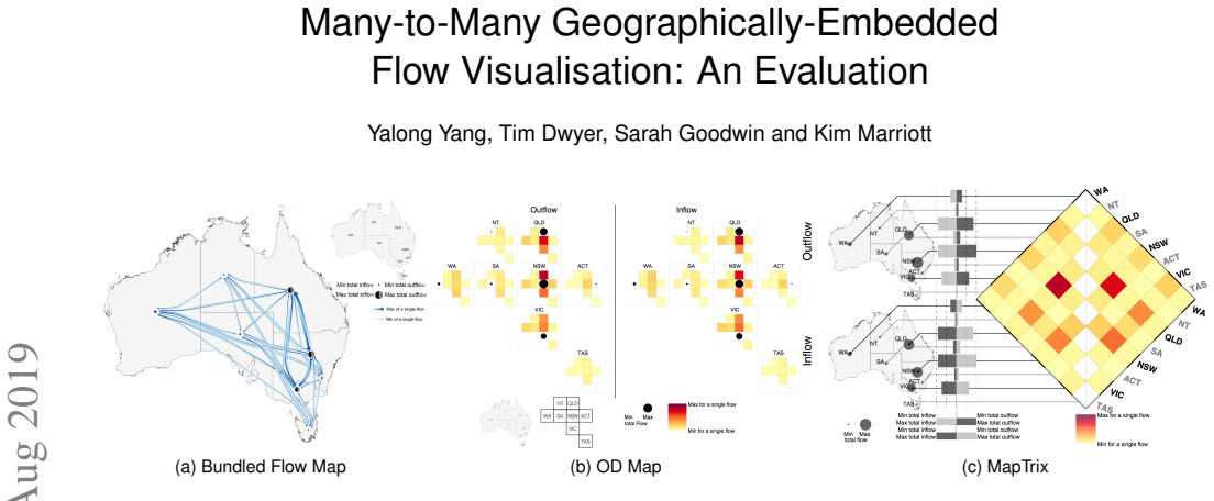
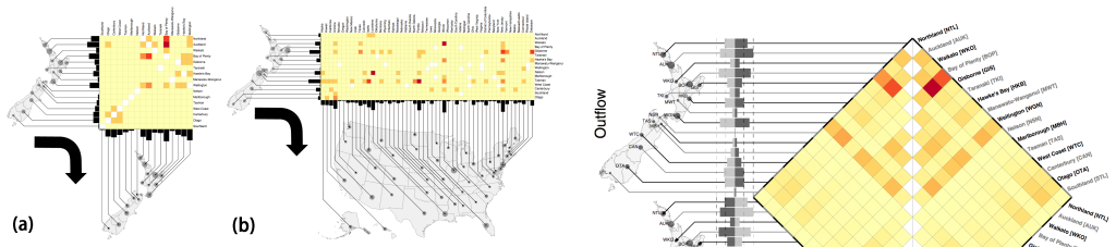
MapTrix connects an origin-destination matrix to an origin map and a destination map: each matrix row and column is linked to its geographic location by a leader line, giving the geographic embedding of a flow map without the line clutter of drawing every flow. The layout is computed in two stages: first, a one-sided boundary labelling method orders rows and columns so that leader lines are crossing-free; second, a novel quadratic program repositions each connection point within its region boundary to maximise separation between adjacent leader lines. This two-stage machinery is what lets MapTrix keep real map geography while remaining readable at 51 by 51 flows.
What would settle it
A larger or more sensitive study, or one with a pre-specified equivalence margin, that finds a consistent and significant accuracy or response-time advantage for one method on single-flow or regional tasks would refute the claimed equivalence. A concrete test would be to run the second study's 51-location dataset without highlighting, or with domain experts instead of students, and check whether regional-flow performance remains comparable between MapTrix and OD Maps.
Extended reading notes
Core claim
The paper's central discovery, stated on its own terms, is that for dense many-to-many flows, geographic embedding can be added to an OD matrix without hurting readability: OD Maps and MapTrix performed comparably across total-flow, single-flow, and regional-flow task types, while bundled node-link flow maps were markedly less accurate for single-flow tasks once datasets reached 16 locations. In the second study, with 34 and 51 locations, OD Maps and MapTrix again produced similar accuracy and response times, with no consistent or statistically significant task-level advantage for either. Regional aggregate tasks were extremely difficult for both methods without highlighting, and became accurate and relatively quick once highlighting simulated interaction. The paper therefore establishes an empirical equivalence between two matrix-based geographic designs and a clear scalability boundary for bundled arrow maps.
Load-bearing premise
The studies treat the absence of statistically significant differences between OD Maps and MapTrix as evidence that they perform equally, without demonstrating that the experiments had enough participants to detect meaningful differences or that the six chosen task types cover all important analyses for many-to-many flows.
Editorial extensions
If this is right
- For dense many-to-many flows with more than a handful of locations, static bundled arrow maps should not be the default representation: they were significantly worse for single-flow lookups and regional judgments.
- MapTrix is a viable alternative to OD Maps for static displays, so designers who want true map geography rather than a schematic grid can choose MapTrix without expecting a task-performance penalty.
- Both MapTrix and OD Maps can display datasets as large as 51 origins and 51 destinations, but reading individual flows is slow and regional aggregate comparisons are impractical without highlighting or other interaction.
- The task taxonomy used in the studies, spanning total-flow, single-flow, and regional-flow questions, provides a reusable benchmark for future evaluations of flow visualisations.
- Interaction designs such as row and column highlighting, value filtering, and aggregate region selection can directly support the tasks where static MapTrix and OD Maps struggle, and the relayout involved is fast enough for interactive use.
Reading between the lines
- Extension: Because the similarity claim rests on null results, a formal equivalence test with pre-specified margins on the same datasets would either firm up or weaken the paper's central conclusion.
- Extension: The second study's highlighting condition changes the comparison from purely static to interaction-aided, so a head-to-head study where both methods receive identical interactive highlighting could reveal whether the apparent OD-versus-MapTrix equivalence persists once users can select regions directly.
- Extension: The paper's leader-line layout algorithm could be adapted to dynamic or temporal flow data, where a natural next test is whether smooth transitions between relayouts preserve users' mental maps of the matrix and map positions.
- Extension: The task results suggest that for regional aggregate questions, the bottleneck is not the visual encoding of individual flows but the user's ability to identify and compare groups of cells; interface features such as searchable labels or region outlines may be more impactful than further tuning the static layout.
Signed reviews
Editorial analysis
A structured set of objections, weighed in public.
Referee Report
Summary. This paper presents MapTrix, a hybrid visualization of dense many-to-many geographic flows in which an origin map and a destination map are connected to the rows and columns of an OD matrix by crossing-free leader lines; the layout is computed by a one-sided boundary-labeling method followed by a quadratic program that increases leader separation (Section 3). The contributions are the MapTrix design and layout algorithm, and two online user studies. Study 1 (60 valid participants, 8-16 locations from Australia, Germany, and New Zealand) compares bundled flow maps, OD Maps, and MapTrix on six task types (TFI, TFS, SFI, SFSo, SFSm, RF). Study 2 (46 valid participants, 34 locations in China and 51 in the United States) compares OD Maps and MapTrix, with highlighting added for the regional-flow tasks. The paper reports that OD Maps and MapTrix both strongly outperform bundled flow maps for most single-flow tasks at larger data sizes, and that no statistically significant accuracy differences were found between OD Maps and MapTrix; on this basis it concludes that the two methods perform 'remarkably similar', with MapTrix preferred for visual design in both studies.
Significance. If the similarity claim could be substantiated, this would be a useful result for geographic visualization: MapTrix would offer a geography-preserving alternative to OD Maps' abstract treemap layout with at least comparable readability, and the paper would deliver what it claims is the first quantitative benchmark of static dense many-to-many flow representations. The strengths are real: counterbalancing of methods, countries, and training order; randomized per-question data; verification questions during training; transparent exclusion criteria; appropriate non-parametric statistics; and triangulation of accuracy, response time, preference rankings, and qualitative feedback across seven countries. The leader-line placement algorithm (quadratic program with hard ordering and separation constraints, Eqs. 1-3) is compact and reproducible from the text, and the authors explicitly disclose limitations such as the student/researcher participant pool and report the descriptive accuracy gaps that cut against their own headline.
major comments (3)
- [§4.4 and §5.1] The paper's central claim that OD Maps and MapTrix perform 'remarkably similar' rests on non-significant accuracy differences, yet the same result sections report statistically significant response-time differences between the two methods in both studies (DE/SFI: p=0.0087 with MapTrix slower than OD; DE/SFSm: p=0.0485 with MapTrix faster; CN/SFI: p=0.0373 with MapTrix slower; CN/SFSm: p<0.0001 with OD slower). The summary statements that 'OD and MT show no significant differences in performance across all conditions' (Section 4.4) and that results are 'remarkably similar across all conditions' (Section 5.1) are therefore inconsistent with the paper's own timing analyses. The conclusions must either incorporate these timing differences into the similarity claim or explicitly restrict the claim to accuracy.
- [§4.3, §4.4 and §5.1] Non-significance is used as evidence of equivalent performance without equivalence testing or a power analysis: with n≈20 per country pair in Study 1 and n=46 in Study 2, the non-significant accuracy differences are compatible with practically large true differences, and the paper itself reports accuracy gaps of 17-24 percentage points (CN/SFI: OD 82% vs MapTrix 62%; CN/SFSm: OD 82% vs 65%; US/TFS: OD 98% vs 74%). The authors should report an equivalence analysis with pre-specified bounds (for example, two one-sided tests or confidence intervals on the OD-MapTrix accuracy differences) or a minimal-detectable-effect calculation, and then re-word the abstract and conclusions to match what the evidence actually supports.
- [§5, 'Pilot Test and Highlighting'] In Study 2, the regional-flow tasks were answered with highlighting added to both visualizations, because pilots showed the unassisted tasks were too time-consuming; a few participants even commented that the RF task 'would be near impossible without the highlighting'. The RF results in Section 5.1, and any overall scalability conclusions that include them, therefore describe interaction-aided versions rather than the static designs that the paper's main comparison claims to evaluate. The claims in Sections 5.1 and 7 should be scoped consistently to the highlighted interactive variant, or the static comparison should be restricted to the non-RF tasks.
minor comments (6)
- [§1 and §4.3] The Wilcoxon test is misspelled 'Wilcoxin' and 'ANOVA' appears as 'ANOV A' in the Statistical Analysis Methods paragraph, and Section 1 contains 'questionaire'; these typos should be corrected.
- [§3.2] The objective terms PCentre and PSep are not numbered while Eqs. (1)-(3) are, which makes the optimization problem harder to reproduce; the claim that solving the quadratic program takes 'a fraction of a second' for hundreds of sites should be supported by a measured runtime.
- [§4.3 and §5] The training materials, example questions, and stimuli are referenced as supplementary material but are not included in this arXiv version; the authors should deposit the questionnaires, stimuli, and analysis scripts (for example on OSF) so that the 'half points' scoring for Almost responses and the participant exclusions can be audited.
- [§4.2 and §5] Because the OD Map grid layouts were hand-crafted by the authors for each country, a sentence stating whether the layouts were reviewed by Wood et al. or validated in another way would reduce concern about unintentional bias in the baseline condition.
- [§5.1] The readability ranking that switched to OD Maps (60.9% first) is described only with percentages; reporting counts or a contingency table, as well as the number of respondents who also participated in Study 1, would make the preference analysis interpretable.
- [§7] The conclusion that 'country shape' did not affect performance is not supported by the design, because the Study 1 countries differ simultaneously in region count, data magnitude, and shape, and shape was not manipulated independently; this sentence should be framed as an exploratory observation.
Circularity Check
No circularity: the paper reports comparative user studies with independent baselines, and its layout algorithm is not fitted to the study outcomes.
full rationale
This paper does not contain a derivation chain in which a prediction is obtained from inputs that already contain the result. Its central claims are empirical comparisons between MapTrix, OD Maps, and a bundled node-link flow map, based on two user studies. MapTrix is a new visualization design; its leader-line layout is computed from a one-sided boundary labeling method by Bekos et al. and a quadratic program whose objective penalizes displacement from initial connection sites and encourages equal separation, with a weight w chosen by the authors. There is no indication that w or any other layout parameter was fitted to the participant accuracy or response-time data, so the evaluation results are not forced by construction. OD Maps are an independent baseline from prior work by Wood, Dykes, and Slingsby, not by the present authors, and the bundled flow map is adapted from Pupyrev et al.; neither baseline is defined in terms of MapTrix or vice versa. The only self-reference is the authors' own online demo of MapTrix, cited as supporting material; it is not load-bearing for the studies' conclusions. The skeptical concern that non-significant differences are treated as evidence of similar performance is a question of statistical inference and study power, not circularity, and therefore does not raise the score. The task taxonomy is researcher-defined, but that is a design choice, not a circular reduction. The paper is self-contained as an evaluation study, and no fitted parameter is renamed as a prediction.
Assumptions & free parameters
free parameters (2)
- Leader separation weight w =
not specified (w >= 0)
- Minimum separation distances dbi and dlc =
not specified
assumptions (4)
- domain assumption The six task categories TFI, TFS, SFI, SFSo, SFSm, RF are representative of real commodity-flow analysis tasks.
- domain assumption University and research mailing list participants are representative of the target users of these visualisations.
- domain assumption Simple highlighting (as added in Study 2 for RF tasks) is equivalent to interaction available in practice and does not bias the comparison.
- standard math Friedman ANOVA, Wilcoxon signed-rank tests, and multilevel models are appropriate for this mixed design.
Cite this review
Pith. "Pith review of Many-to-Many Geographically-Embedded Flow Visualisation: An Evaluation." pith.science (2026). https://pith.science/paper/VAJM6ZD6
@misc{pith2026190802052,
  author       = {Pith},
  title        = {Pith review of: Many-to-Many Geographically-Embedded Flow Visualisation: An Evaluation},
  year         = {2026},
  howpublished = {\url{https://pith.science/paper/VAJM6ZD6}},
  note         = {Machine review of arXiv:1908.02052}
}
read the original abstract
Showing flows of people and resources between multiple geographic locations is a challenging visualisation problem. We conducted two quantitative user studies to evaluate different visual representations for such dense many-to-many flows. In our first study we compared a bundled node-link flow map representation and OD Maps [37] with a new visualisation we call MapTrix. Like OD Maps, MapTrix overcomes the clutter associated with a traditional flow map while providing geographic embedding that is missing in standard OD matrix representations. We found that OD Maps and MapTrix had similar performance while bundled node-link flow map representations did not scale at all well. Our second study compared participant performance with OD Maps and MapTrix on larger data sets. Again performance was remarkably similar.
Figures

Figures from the paper (6 more)


Reference graph
Works this paper leans on
-
[1]
N. Andrienko and G. Andrienko. Exploratory Analysis of Spatial and Temporal Data: A Systematic Approach . Springer Science & Business Media, 2006
work page 2006
-
[2]
M. A. Bekos, M. Kaufmann, M. N ¨ollenburg, and A. Symvonis. Boundary Labeling with Octilinear Leaders. Algorithmica, 57(3):436–461, 2009
work page 2009
-
[3]
M. A. Bekos, M. Kaufmann, and A. Symvonis. Boundary labeling: Models and efficient algorithms for rectangular maps. Computational Geometry, 36(3):215–236, 2007
work page 2007
-
[4]
M. A. Bekos and A. Symvonis. Boundary Labeling with Octilinear Leaders and Minimum Number of Leader-Bends. In International conference on applied computer science, pages 208–213, 2010
work page 2010
-
[5]
J. Bertin. Semiologie graphique: les diagrammes, les rseaux, les cartes . La Haye, Mouton; Gauthier-Villars, 1967
work page 1967
-
[6]
Q. W. Bouts. Clustered edge routing. In 2015 IEEE Pacific Visualization Symposium (PacificVis), pages 55–62. IEEE, 2015
work page 2015
-
[7]
Boyandin, E
I. Boyandin, E. Bertini, P. Bak, and D. Lalanne. Flowstrates: An Approach for Visual Exploration of Temporal Origin-Destination Data. Computer Graphics Forum, 30(3):971–980, 2011
2011
-
[8]
Y . Chiricota, G. Melanc ¸on, T. T. P. Quang, and P. Tissandier. Visual Exploration of (French) Commuter Networks. In Geovisualization of Dynamics, Movement, and Change AGILE Satellite Workshop, 2008
work page 2008
Show all 39 references
-
[9]
B. D. Dent, J. S. Torguson, and T. W. Hodler. Cartography: Thematic Map Design. McGraw-Hill, 6 edition, 2008
2008
-
[10]
Field, J
A. Field, J. Miles, and Z. Field. Discovering Statistics Using R . SAGE Publications, 2012
2012
-
[11]
Ghoniem, J.-D
M. Ghoniem, J.-D. Fekete, and P. Castagliola. A Comparison of the Readability of Graphs Using Node-Link and Matrix-Based Representations. IEEE Symposium on Information Visualization , pages 17–24, 2004
2004
-
[12]
Gilbert, A
M. Gilbert, A. Mitchell, D. Bourn, J. Mawdsley, R. Clifton-Hadley, and W. Wint. Cattle movements and bovine tuberculosis in Great Britain. Nature, 435(7041):491–496, 2005
2005
-
[13]
D. Guo. Visual analytics of spatial interaction patterns for pandemic decision support. International Journal of Geographical Information Science, 21(8):859–877, 2007
2007
-
[14]
D. Guo, J. Chen, A. M. MacEachren, and K. Liao. A visualization system for space-time and multivariate patterns (vis-stamp). IEEE Transactions on Visualization and Computer Graphics, 12(6):1461–1474, 2006
2006
-
[15]
Harrower and C
M. Harrower and C. A. Brewer. ColorBrewer.org: An Online Tool for Selecting Colour Schemes for Maps. The Cartographic Journal , 40(1):27–37, 2003
2003
-
[16]
Holten, P
D. Holten, P. Isenberg, J. J. Van Wijk, and J.-D. Fekete. An extended evaluation of the readability of tapered, animated, and textured directed-edge representations in node-link graphs. In Pacific Visualization Symposium (PacificVis), 2011 IEEE, pages 195–202, 2011
2011
-
[17]
Johnson and E
H. Johnson and E. S. Nelson. Using Flow Maps to Visualize Time-Series Data: Comparing the Effectiveness of a Paper Map Series, a Computer Map Series, and Animation. Cartographic Perspectives, 0(30):47–64–64, Jan. 1998
1998
-
[18]
Kelly, A
M. Kelly, A. Slingsby, J. Dykes, and J. Wood. Historical Internal Migration in Ireland. In GIS Research UK (GISRUK), 2013
2013
-
[19]
D. F. Marble, Z. Gou, L. Liu, and J. Saunders. Recent advances in the exploratory analysis of interregional flows in space and time.Innovations in GIS, 4:75–88, 1997
1997
-
[20]
Nguyen, P
Q. Nguyen, P. Eades, and S.-H. Hong. On the faithfulness of graph visualizations. In Visualization Symposium (PacificVis), 2013 IEEE Pacific, pages 209–216. IEEE, 2013
2013
-
[21]
Nocaj and U
A. Nocaj and U. Brandes. Stub Bundling and Confluent Spirals for Geographic Networks. In Graph Drawing , pages 388–399. Springer International Publishing, 2013
2013
-
[22]
Paci and S
R. Paci and S. Usai. Knowledge flows across European regions. The Annals of Regional Science, 43(3):669–690, 2008
2008
-
[23]
D. Phan, L. Xiao, R. Yeh, and P. Hanrahan. Flow map layout. In Proceedings of IEEE Symposium on Information Visualization. INFOVIS 2005., pages 219–224, 2005
2005
-
[24]
Pupyrev, L
S. Pupyrev, L. Nachmanson, S. Bereg, and A. E. Holroyd. Edge routing with ordered bundles. InGraph Drawing, pages 136–147. Springer, 2012
2012
-
[25]
A. Rae. From spatial interaction data to spatial interaction information? Geovisualisation and spatial structures of migration from the 2001 UK census. Computers, Environment and Urban Systems , 33(3):161–178, 2009
2001
-
[26]
Ramathan, J
A. Ramathan, J. Dykes, and J. Wood. Framework for Studying Spatially Ordered Treemaps. In 26th International Cartographic Conference , 2013
2013
-
[27]
A. H. Robinson. The 1837 Maps of Henry Drury Harness. The Geographical Journal, 121(4):440–450, 1955
1955
-
[28]
A. H. Robinson. The Thematic Maps of Charles Joseph Minard. Imago Mundi, 21:95–108, 1967
1967
-
[29]
W. Tobler. Depicting Federal Fiscal Transfers. The Professional Geographer, 33(4):419–422, Nov. 1981
1981
-
[30]
W. R. Tobler. Experiments In Migration Mapping By Computer. Cartography and Geographic Information Science, 14(2):155–163, 1987
1987
-
[31]
C. Tobon. Evaluating geographic visualization tools and methods: An approach and experiment based upon user tasks. In M.-J. Kraak, J. Dykes, and A. M. MacEachren, editors, Exploring Geovisualization, International Cartographic Association, pages 645 – 666. Elsevier, 2005
2005
-
[32]
van den Elzen and J
S. van den Elzen and J. J. van Wijk. Multivariate network exploration and presentation: From detail to overview via selections and aggregations. IEEE Transactions on Visualization and Computer Graphics, 20(12):2310–2319, 2014
2014
-
[33]
Verbeek, K
K. Verbeek, K. Buchin, and B. Speckmann. Flow Map Layout via Spiral Trees. IEEE Transactions on Visualization and Computer Graphics , 17(12):2536–2544, 2011
2011
-
[34]
A. M. V oorhees. A general theory of traffic movement. Transportation, 40(6):1105–1116, 2013
2013
-
[35]
Wilkinson and M
L. Wilkinson and M. Friendly. The History of the Cluster Heat Map. The American Statistician, 63(2):179–184, 2009
2009
-
[36]
Wood and J
J. Wood and J. Dykes. Spatially Ordered Treemaps. IEEE Transactions on Visualization and Computer Graphics, 14(6):1348–1355, 2008
2008
-
[37]
J. Wood, J. Dykes, and A. Slingsby. Visualisation of Origins, Destinations and Flows with OD Maps. The Cartographic Journal , 47(2):117–129, May 2010
2010
-
[38]
J. Wood, A. Slingsby, and J. Dykes. Visualizing the Dynamics of London’s Bicycle-Hire Scheme. Cartographica: The International Journal for Geographic Information and Geovisualization , 46(4):239–251, 2011
2011
-
[39]
Y . Yang, T. Dwyer, S. Goodwin, and K. Marriott. MapTrix online demo: http://vis.yalongyang.com/maptrix/index.html, 2016
2016
Reviewed August 14, 2026 · model on record in the stance chip above.
Discussion (0). Continue with ORCID to comment.