REVIEW 2 major objections 7 minor 36 references
Visualizing the treatment effect on kidney hierarchical composite endpoints: From mosaic to maraca plots
T0 review · 2 major / 7 minor · reviewed 2026-08-07 · deepseek-v4-flash
Pith's one-line read For kidney hierarchical composite endpoints, a two-dimensional mosaic plot whose area above the ordinal dominance graph equals the win probability is the analysis-specific visualization, with maraca, sunset, and cumulative component plots…
desk verdict A useful HCE visualization paper with a genuinely good mosaic plot and a sunset plot that lacks the model specification needed to support its design-stage claims. read the letter →
The pith
A machine-rendered reading of the paper's core claim, the machinery that carries it, and where it could break.
The reading
What carries the argument
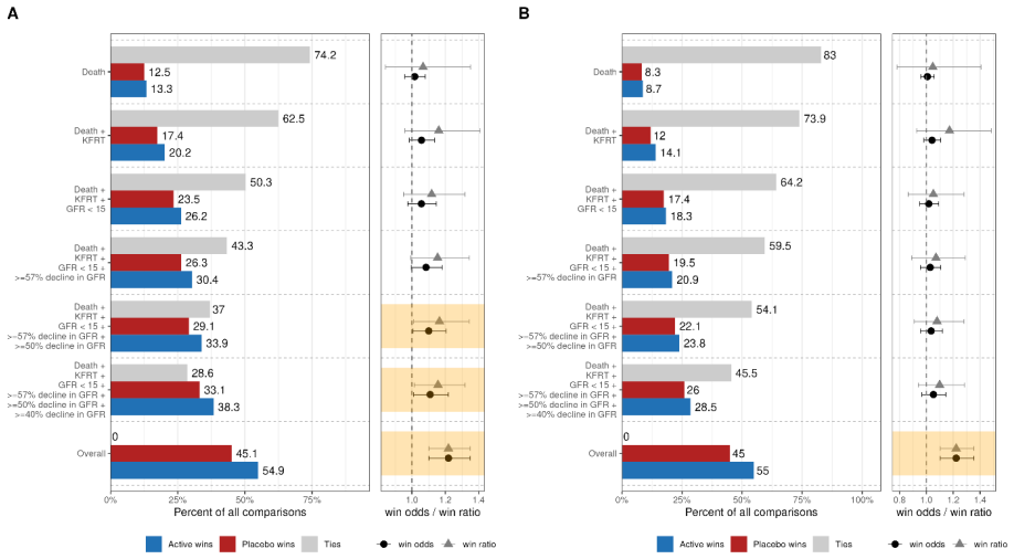
The machinery is the product-plot construction, in which the area of a graphical element is proportional to probability: with active outcomes on the vertical axis and control outcomes on the horizontal axis, the width and height of each bar are the marginal proportions in the two arms, so the bar's area is the joint probability of that pair of outcomes. The ordinal dominance graph is the boundary separating pairs where the active patient wins from pairs where the control patient wins; the area above it is the win probability, and the diagonal is the null reference. In the kidney hierarchical composite endpoint, ties are essentially eliminated by using event timing and the continuous GFR value, so the win region is the area above the graph. The maraca plot shows the cumulative proportions of each hierarchical outcome end to end with the continuous outcome distribution, while the cumulative component plot is a forest plot that recalculates win odds and win ratio as outcomes are added from highest to lowest priority. The sunset plot is a two-dimensional contour map of win odds over the hazard-ratio and mean-difference plane, modulated by event rates and the standard deviation of the continuous outcome; this mapping is presented through simulated examples, and its exact functional form is not given in the paper.
What would settle it
Run a simulation where the time-to-event and continuous components are correlated or hazards are non-proportional, compute the true win odds, and compare them with the sunset contours produced from the paper's stated inputs; a systematic mismatch at known event rates and standard deviations would show that the plot is not a reliable design map until the mapping is specified.
Extended reading notes
Core claim
The paper's discovery is a visual encoding, not a new estimator: for a hierarchical composite endpoint, a two-dimensional mosaic plot whose cell areas are joint probabilities of active and control outcomes displays the win probability directly. When the ordinal dominance graph is drawn on this mosaic, the area above the graph is exactly the probability that a randomly chosen active patient beats a randomly chosen control patient, and the win odds follows as the ratio of the win region to the loss region. The diagonal represents the no-effect reference, and a win region crossing it corresponds to win odds greater than one. The paper therefore recommends this mosaic as the primary analysis-specific visualization, with the maraca plot remaining the primary analysis-independent display of the endpoint's distribution. Around these, the sunset plot provides a design-stage contour map of all win odds achievable from combinations of component effects, and the cumulative component plot shows the contribution of each priority level to the overall win odds. The kidney disease progression hierarchical composite endpoint, death, kidney failure, and eGFR decline, is used as the running example, and the sunset plot's realistic region is shaded using reanalyses of chronic kidney disease trials.
Load-bearing premise
The load-bearing assumption is that the sunset plot's contours correctly map component effects to the overall win odds through an unspecified model; if non-proportional hazards, correlated components, or other departures change that mapping, the design-stage landscape would mislead.
Editorial extensions
If this is right
- A trial report can pair the maraca plot with the two-dimensional mosaic: the maraca shows who experienced what, and the mosaic shows the win region whose area equals the win probability.
- Because the area above the ordinal dominance graph is exactly the win probability, readers can see the treatment-effect estimate on the graph and compare it with the diagonal no-effect reference.
- At the design stage, the sunset plot translates assumed component effects into the win odds used for sample size planning and shows which combinations of hazard ratio and mean difference yield the same overall win odds.
- The cumulative component plot makes the hierarchy transparent: adding outcomes from highest to lowest priority shows when significance emerges and when ties disappear, at which point win odds and win ratio coincide.
- For the kidney hierarchical composite endpoint, the plausible region of component effects is narrow, so the sunset plot can show that the endpoint's win odds are anchored by a consistent biological direction rather than arbitrary trade-offs.
Reading between the lines
- The same plot suite should transfer to hierarchical composite endpoints outside kidney disease, such as heart failure or COVID-19 trials, because the mosaic's win-region encoding does not depend on kidney biology.
- An interactive or parameterized sunset plot could be used during trial monitoring to update the expected win odds as blinded event rates and variability become known, an extension the paper does not discuss.
- The sunset plot's missing model specification is the easiest place to strengthen the approach; a closed-form mapping or a validated simulation engine would allow the design contours to carry confidence regions rather than point contours.
- The mosaic could likely be extended to display adjusted or stratified win statistics by weighting cell areas, whereas the paper presents the unadjusted win odds.
Editorial analysis
A structured set of objections, weighed in public.
Referee Report
Summary. The manuscript proposes a suite of visualizations for hierarchical composite endpoints (HCEs) analyzed by win statistics, using the kidney disease progression HCE as a running example. It introduces (i) a two-dimensional mosaic plot in which the area above the diagonal/ordinal dominance graph equals the win probability and thus directly encodes win odds; (ii) the maraca plot as the recommended primary, analysis-independent visualization; (iii) a cumulative component forest plot (the "Dustin plot") for assessing component contributions; and (iv) a "sunset plot" intended to map the overall win odds as a function of component treatment effects (hazard ratio and mean difference in GFR) at the design stage. The paper also discusses conceptual differences in visualizing continuous, binary, time-to-event, and ordinal endpoints. The mathematical identity connecting the mosaic plot to win statistics is sound, but the sunset plot is currently presented without a model or simulation specification, which prevents verification of its contours.
Significance. If the sunset-plot gap is filled, the paper would provide a useful, well-motivated toolkit for communicating HCE treatment effects. The 2D mosaic plot is a genuinely instructive construction: it uses product-plot area to represent the joint distribution of ordinal outcomes and shows that the area above the ordinal dominance graph is the win probability, making the treatment-effect measure visually transparent. The Dustin plot and maraca examples are practical, and the software implementation via the hce and maraca R packages is a concrete strength. The design-stage sunset plot is a promising idea for sample-size and what-if exploration, but as it stands it is non-reproducible and its "all possible treatment effects" claim is not substantiated. The paper is relevant for applied statisticians and clinical trialists, and its visual proposals are testable once the underlying model is specified.
major comments (2)
- [Treatment effect on the HCE: The sunset plot for win odds (Figure 6)] The manuscript does not specify the model or simulation used to compute the overall win odds from the component hazard ratio, mean difference, event rate, and standard deviation. No equations, distributional assumptions (e.g., exponential versus Weibull), censoring mechanism, dependence structure between the time-to-event and continuous components, or tie-breaking rule are given. Because the same input tuple can produce materially different win odds under different plausible models, the contours in Figure 6 are not reproducible, and the claim that the plot shows "all possible treatment effects" is not supported. Please provide the generating algorithm or an analytic derivation, and define precisely the set of models under which the plotted landscape is exhaustive.
- [Treatment effect on the HCE: The sunset plot for win odds (Figure 7)] The shaded "area of possibility" derived from 7 CKD trials is presented without the underlying data, the mapping used to convert observed component effects to the (hazard ratio, mean GFR difference) axes, or details on how "eGFR slope rather than delta" enters the calculation. Without this information, readers cannot verify that the shaded region corresponds to the claimed narrow range of possible treatment effects. This is load-bearing for the design-stage recommendation that the shaded area be used to restrict the design space.
minor comments (7)
- [Abstract] "While the 2-d mosaic plot ... method" is a sentence fragment; remove the initial "While" or rewrite as a complete sentence.
- [Treatment effect on the HCE: The sunset plot for win odds (Figure 6)] The figure caption describes the solid grey line as "on the edge between red/green," but the text suggests it is a contour at WO = 1.2; clarify whether the grey line is a contour and how contour labels are chosen.
- [Visualization of treatment effect as a difference in distributions] The statements that win odds is directly related to the standardized mean difference for normal distributions and to a standardized median difference for log-normal distributions would benefit from explicit formulas or a brief derivation, since the relationship is nonlinear and not immediately obvious.
- [Contribution of components: Cumulative Component Forest Plot for win odds] The sentence "the width of the confidence interval for the win odds decreases with the increase in the number of ties" is counterintuitive as written; add a one-sentence explanation or a displayed variance formula to support it.
- [Treatment effect on the HCE: The sunset plot for win odds] The text says the sunset plot is constructed from "three simulated combinations" but gives no simulation details; even after adding the model, a reproducibility script or R package function would be essential.
- [Treatment effect on the HCE: The sunset plot for win odds (Figure 7)] State explicitly which 7 CKD trials and which analysis define the shaded region, and provide data or a link to a reproducibility repository so readers can check the mapping.
- [References] References marked "Submitted, 2025" (refs 21 and 26) should be updated if accepted or clearly labeled as preprints.
Circularity Check
No circular derivation: the visualizations are direct constructions from win-statistics definitions, with self-citations used for attribution and software only.
full rationale
The paper's central claims are new graphical constructions rather than derivations of empirical results from fitted inputs. The 2-d mosaic plot encodes win probability as the area above the ordinal dominance graph; this is a faithful geometric encoding of the Mann-Whitney form of the win probability, not a reduction of a fitted parameter to a prediction. The maraca plot and the Dustin plot are descriptive visualizations of the HCE distribution and cumulative component contribution; the cited prior work (refs 11, 26, 32, 33) is attribution and software support, and the figures in this manuscript are self-contained demonstrations. The sunset plot is asserted to calculate win odds for combinations of hazard ratios and mean GFR differences, but no equation or simulation model is given. That omission makes Figure 6 non-reproducible and is a correctness or reproducibility concern, not circularity: the contours are not defined in terms of the conclusion they are used to illustrate, and no fitted parameter is renamed as a prediction. No step in the paper reduces by construction to its own inputs.
Assumptions & free parameters
free parameters (3)
- Dichotomous event rate (proportion of patients with clinical outcomes) =
Not reported; three scenarios in Figure 6
- Standard deviation of the continuous GFR outcome =
Not reported
- Hazard ratio and mean difference axis ranges =
HR 0.50-1.15; mean GFR diff -0.5 to 2.0
assumptions (4)
- standard math The area above the ordinal dominance graph equals the win probability (Bamber 1975).
- domain assumption The overall win odds for the HCE is a deterministic function of component hazard ratio, mean difference in continuous outcome, event rates, and SD of the continuous outcome.
- domain assumption The treatment effects on kidney HCE components are positively correlated, as observed across 7 CKD trials.
- domain assumption For normally distributed continuous endpoints, win odds is directly related to the standardized mean difference.
Cite this review
Pith. "Pith review of Visualizing the treatment effect on kidney hierarchical composite endpoints: From mosaic to maraca plots." pith.science (2026). https://pith.science/paper/J4QQUXDA
@misc{pith2026250602287,
  author       = {Pith},
  title        = {Pith review of: Visualizing the treatment effect on kidney hierarchical composite endpoints: From mosaic to maraca plots},
  year         = {2026},
  howpublished = {\url{https://pith.science/paper/J4QQUXDA}},
  note         = {Machine review of arXiv:2506.02287}
}
read the original abstract
Visualizations, alongside summary tables and participant-level listings, are essential for presenting clinical trial results transparently and comprehensively. When reporting the results of clinical trials, the goal of visualization is to communicate the results of specific pre-planned analyses with visualization that are tailored to the endpoint and analysis being reported. We are considering the visualization of HCEs, combining multiple time-to-event outcomes, ordered according to a given prioritization and the timing of events, with a single continuous outcome. An illustrative example is the kidney disease progression HCE with a straightforward structure of the composite of clinical events of death and kidney failure and declines in eGFR as surrogates for kidney failure. The HCEs are analyzed by win statistics and visualized using maraca plots. Although maraca plots are very granular and allow for a detailed presentation of the distribution of HCE, researchers are still tasked with explanation of the magnitude of the treatment effect estimated by win odds. In explaining the magnitude of the treatment effect, we propose a comprehensive visualization approach. In the clinical trial design stage, we propose the sunset plots to visualize all possible treatment effects that can be observed based on the treatment effects on components. In reporting the results of the trial, we recommend the maraca plots as the primary method of visualization of the results. While the 2-d mosaic plot with the ordinal dominance graph directly corresponds to the win odds as treatment effect measure and can be used as the primary analysis-specific visualization method. And finally, we propose the Dustin plot to visualize the supportive analysis of the components, added cumulatively from the event of highest priority to assess the consistency of the treatment effect on all outcomes.
Figures


Figures from the paper (4 more)



Reference graph
Works this paper leans on
-
[1]
Gasparyan, S.B., et al., Hierarchical Composite Endpoints in COVID-19: The DARE-19 Trial, in Case Studies in Innovative Clinical Trials. 2023, Chapman and Hall/CRC. p. 95-148
work page 2023
-
[2]
Journal of the American Society of Nephrology, 2023
Little, D.J., et al., Validity and utility of a hierarchical composite endpoint for clinical trials of kidney disease progression: A review. Journal of the American Society of Nephrology, 2023. 34(12): p. 1928-1935. 16
work page 2023
-
[3]
Kondo, T., et al., Use of Win Statistics to Analyze Outcomes in the DAPA-HF and DELIVER Trials. NEJM Evidence, 2023. 2(11): p. EVIDoa2300042. https://doi.org/10.1056/EVIDoa2300042
-
[4]
Pharmaceutical Statistics, 2023
Dong, G., et al., Win statistics (win ratio, win odds, and net benefit) can complement one another to show the strength of the treatment effect on time‐to‐event outcomes. Pharmaceutical Statistics, 2023. 22(1): p. 20-33
work page 2023
-
[5]
Pocock, S.J., et al., The win ratio: a new approach to the analysis of composite endpoints in clinical trials based on clinical priorities. European heart journal, 2012. 33(2): p. 176-182
work page 2012
-
[6]
Brunner, E., M. Vandemeulebroecke, and T. Mütze, Win odds: An adaptation of the win ratio to include ties. Statistics in Medicine, 2021. 40(14): p. 3367-3384
work page 2021
-
[7]
Journal of Biopharmaceutical Statistics, 2021
Gasparyan, S.B., et al., Power and sample size calculation for the win odds test: application to an ordinal endpoint in COVID-19 trials. Journal of Biopharmaceutical Statistics, 2021. 31(6): p. 765- 787
work page 2021
-
[8]
Statistics in Biopharmaceutical Research, 2019
Dong, G., et al., The win ratio: on interpretation and handling of ties. Statistics in Biopharmaceutical Research, 2019
work page 2019
Show all 36 references
-
[9]
Statistical Methods in Medical Research, 2021
Gasparyan, S.B., et al., Adjusted win ratio with stratification: calculation methods and interpretation. Statistical Methods in Medical Research, 2021. 30(2): p. 580-611
2021
-
[10]
Statistics in Medicine, 2010
Buyse, M., Generalized pairwise comparisons of prioritized outcomes in the two‐sample problem. Statistics in Medicine, 2010. 29(30): p. 3245-3257
2010
-
[11]
Lindholm, and S.B
Karpefors, M., D. Lindholm, and S.B. Gasparyan, The maraca plot: A novel visualization of hierarchical composite endpoints. Clinical Trials, 2022. 20(1): p. 84-88
2022
-
[12]
Nature Medicine, 2024: p
Kondo, T., et al., A hierarchical kidney outcome using win statistics in patients with heart failure from the DAPA-HF and DELIVER trials. Nature Medicine, 2024: p. 1-8
2024
-
[13]
Journal of the Royal Statistical Society: Series C (Applied Statistics), 1978
Cox, D., Some remarks on the role in statistics of graphical methods. Journal of the Royal Statistical Society: Series C (Applied Statistics), 1978. 27(1): p. 4-9
1978
-
[14]
Hartigan, J.A. and B. Kleiner, A mosaic of television ratings. The American Statistician, 1984. 38(1): p. 32-35
1984
-
[15]
Journal of mathematical psychology, 1975
Bamber, D., The area above the ordinal dominance graph and the area below the receiver operating characteristic graph. Journal of mathematical psychology, 1975. 12(4): p. 387-415
1975
-
[16]
Ther Innov Regul Sci, 2022
Gasparyan, S.B., et al., Design and Analysis of Studies Based on Hierarchical Composite Endpoints: Insights from the DARE-19 Trial. Ther Innov Regul Sci, 2022. 56(5): p. 785-794
2022
-
[17]
2018: Chapman and Hall/CRC
Chambers, J.M., et al., Graphical methods for data analysis. 2018: Chapman and Hall/CRC
2018
-
[18]
Tukey, and W.A
McGill, R., J.W. Tukey, and W.A. Larsen, Variations of box plots. The american statistician, 1978. 32(1): p. 12-16
1978
-
[19]
Hintze, J.L. and R.D. Nelson, Violin plots: a box plot-density trace synergism. The American Statistician, 1998. 52(2): p. 181-184
1998
-
[20]
Kaplan, E.L. and P. Meier, Nonparametric estimation from incomplete observations. Journal of the American Statistical Association, 1958. 53(282): p. 457-481
1958
-
[21]
Submitted, 2025
Myte, R., et al., Use of Survival Odds to Minimize Bias due to Risk Heterogeneity in Heart Failure Clinical Trials. Submitted, 2025
2025
-
[22]
Biometrika,
Oakes, D., On the win-ratio statistic in clinical trials with multiple types of event. Biometrika,
-
[23]
Wickham, H. and H. Hofmann, Product plots. IEEE Transactions on Visualization and Computer Graphics, 2011. 17(12): p. 2223-2230
2011
-
[24]
The Lancet Diabetes Endocrinology, 2021
Kosiborod, M.N., et al., Dapagliflozin in patients with cardiometabolic risk factors hospitalised with COVID-19 (DARE-19): a randomised, double-blind, placebo-controlled, phase 3 trial. The Lancet Diabetes Endocrinology, 2021. 9(9): p. 586-594. 17
2021
-
[25]
Diabetes, Obesity and Metabolism, 2021
Kosiborod, M., et al., Effects of dapagliflozin on prevention of major clinical events and recovery in patients with respiratory failure because of COVID‐19: Design and rationale for the DARE‐19 study. Diabetes, Obesity and Metabolism, 2021. 23(4): p. 886-896
2021
-
[26]
Submitted., 2025
Little, D.J., et al., Contribution of GFR slope to the kidney hierarchical composite endpoint. Submitted., 2025
2025
-
[27]
NEJM evidence, 2024
James, S., et al., Dapagliflozin in myocardial infarction without diabetes or heart failure. NEJM evidence, 2024. 3(2): p. EVIDoa2300286
2024
-
[28]
Yu, R.X. and J. Ganju, Sample size formula for a win ratio endpoint. Statistics in medicine, 2022. 41(6): p. 950-963
2022
-
[29]
Sample size formula for a win ratio endpoint
Gasparyan, S.B., E.K. Kowalewski, and G.G. Koch, Comments on “Sample size formula for a win ratio endpoint” by RX Yu and J. Ganju. Statistics in Medicine, 2022. 41(14): p. 2688-2690
2022
-
[30]
Journal of the American Society of Nephrology,
Heerspink, H.J., et al., Development and Validation of a New Hierarchical Composite End Point for Clinical Trials of Kidney Disease Progression. Journal of the American Society of Nephrology,
-
[31]
Nature Medicine, 2023
Inker, L.A., et al., A meta-analysis of GFR slope as a surrogate endpoint for kidney failure. Nature Medicine, 2023. 29(7): p. 1867-1876
2023
-
[32]
R package version >=0.5.0
Gasparyan, S.B., hce: Design and Analysis of Hierarchical Composite Endpoints. R package version >=0.5.0. https://doi.org/10.32614/CRAN.package.hce, 2024
2024 doi
-
[33]
Gasparyan, and M
Karpefors, M., S.B. Gasparyan, and M. Huhn, maraca: The Maraca Plot: Visualization of Hierarchical Composite Endpoints in Clinical Trials. R package version >=0.7.0. https://doi.org/10.32614/CRAN.package.maraca, 2024
2024 doi
-
[34]
Use R! 2009, New York, NY: Springer
Wickham, H., ggplot2: Elegant Graphics for Data Analysis. Use R! 2009, New York, NY: Springer. VIII, 213
2009
-
[35]
Journal of the Society for Clinical Data Management, 2024
Gasparyan, S.B., et al., Basic Data Structure for Hierarchical Composite Endpoints: An Application to Kidney Disease Trials. Journal of the Society for Clinical Data Management, 2024. 18 Figure 1. (A) Illustration of the treatment effect as a shift in distributions represented...
2024
-
[2023]
2025-2038
34(12): p. 2025-2038
2025
Reviewed August 7, 2026 · model on record in the stance chip above.
Discussion (0). Sign in to comment.