REVIEW 5 major objections 5 minor 18 references
A Benchmark of Visual Storytelling in Social Media
T0 review · 5 major / 5 minor · reviewed 2026-08-14 · deepseek-v4-flash
Pith's one-line read A two-part quality metric reproduces human ratings of social-media visual storylines.
desk verdict A useful small benchmark dataset with a plausible quality metric, but the 'emulates human perception' claim is an in-sample fit with no statistics. read the letter →
The pith
A machine-rendered reading of the paper's core claim, the machinery that carries it, and where it could break.
The reading
What carries the argument
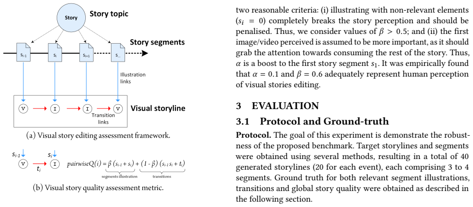
The machinery is the Quality metric, Eqs. (1)-(2), which treats a storyline as a chain where each segment has a relevance score $s_i$ and each adjacent pair has a transition coherence score $t_i$. It computes an overall quality by giving the first segment a small boost through $\alpha$, then averaging pairwise terms that balance the summed relevance of the two illustrations, weighted by $\beta$, against the product of their relevance plus the transition label, weighted by $1-\beta$. The metric is the load-bearing device because every evaluation in the paper — baselines for image selection, baselines for transition smoothness, and the comparison to human judgement — is expressed through it. Its two weights, $\alpha = 0.1$ and $\beta = 0.6$, are presented as empirically adequate representations of human perception.
What would settle it
Take the same annotation protocol, apply it to a held-out set of storylines from at least one event not used in this paper, compute Quality with α=0.1 and β=0.6, and compare against holistic human ratings. If the correlation is much weaker than the reported pattern, or if re-fitting the weights yields values far from 0.1 and 0.6, then the metric's claimed emulation of human perception does not generalise.
Extended reading notes
Core claim
On the paper's own terms, the central discovery is that human perception of visual storyline quality can be expressed as a weighted combination of segment-level relevance and transition-level coherence. Concretely, for a story of N segments the Quality score is $\text{Quality} = \alpha \cdot s_1 + \frac{1-\alpha}{2(N-1)} \sum_{i=2}^{N} \text{pairwiseQ}(i)$, where $\text{pairwiseQ}(i) = \beta \cdot (s_i + s_{i-1}) + (1-\beta) \cdot (s_{i-1} \cdot s_i + t_{i-1})$, with relevance labels $s_i \in \{0,1,2\}$, transition labels $t_i \in \{0,1,2\}$, and empirically chosen weights $\alpha = 0.1$ and $\beta = 0.6$. The reported agreement between this score and annotators' overall ratings indicates that linear increases in human judgement are matched by the metric, and the authors conclude that it effectively emulates human perception.
Load-bearing premise
A single pair of weighting constants, chosen empirically but never tested on fresh data, is assumed to match how people judge story quality for every social-media storyline.
Editorial extensions
If this is right
- Automatic visual storytelling systems can be compared on a common numeric scale, so a text-based retriever that finds relevant images can be measured against approaches that optimise visual coherence between segments.
- Because the metric separates illustration relevance from transition coherence, a system that improves one component should show a corresponding gain in overall Quality, and the benchmark can localise which component is failing.
- The two collected events behave differently: Tour de France storylines are systematically easier to illustrate than Edinburgh Festival storylines, so benchmark results should be reported per event rather than pooled.
- Social signals such as retweet counts and duplicate counts can be competitive with text retrieval for selecting illustrations, while colour-based and CNN-based methods help most on the transition side.
Reading between the lines
- If the metric generalises beyond these two events, it could be adapted as a reward signal for training retrieval or generation models, since it offers a single scalar target that combines semantic relevance and visual coherence.
- The absence of a reported fitting procedure for $\alpha$ and $\beta$ suggests a direct testable extension: re-estimate the weights on a held-out set of storylines and check whether 0.1 and 0.6 remain optimal, since a large shift would indicate the metric encodes dataset-specific calibration rather than a general perceptual law.
- The three-annotator ground truth, without reported inter-annotator agreement, leaves open how much of the metric's apparent success reflects shared editorial preference versus averaged individual taste; measuring agreement directly would clarify the mechanism.
- The same relevance-plus-transition decomposition could be carried over to other sequential multimodal outputs such as automated slide decks, video digests, or illustrated tutorials, where a single quality score would allow direct A/B testing.
Signed reviews
Editorial analysis
A structured set of objections, weighed in public.
Referee Report
Summary. The paper introduces SocialStories, a benchmark for visual storytelling from social media, with 40 curated storylines from two events (EdFest and TDF). It defines a Quality metric (Eqs. 1-2) as a weighted combination of segment relevance s_i and transition coherence t_i, with two free parameters alpha and beta. It evaluates the metric against human overall ratings (Fig. 3) and compares six content-selection baselines and six transition-optimization baselines (Fig. 4). The central claim is that the proposed metric 'effectively emulates the human perception of visual storyline quality' (Section 3.2). The paper also describes the crawling strategy, story segment construction, and the ground-truth annotation protocol with three annotators.
Significance. If the central validity claim were properly established, SocialStories would be a useful resource: it addresses a realistic newsroom task, and the two-term decomposition into relevance and coherence is a sensible, independently motivated design. The paper's concrete assets include a real social-media dataset, a clear protocol for constructing storylines, and a systematic baseline comparison for both illustration selection and transition coherence. However, the current evidence for the metric's perceptual validity is an in-sample fit with no statistical detail, so the central claim is not yet supported. The benchmark infrastructure and baseline results remain useful regardless of the metric's validation, but the paper's advertised contribution as a 'rigorous evaluation' tool is compromised until the metric validation is repaired.
major comments (5)
- [Section 2.2, Eqs. (1)-(2)] The values alpha=0.1 and beta=0.6 are said to be 'empirically found' to represent human perception, but the paper gives no fitting procedure, no search criterion, no train/validation split, and no out-of-sample evaluation. Because the same metric is then shown to correlate with human judgments in Section 3.2, the reported agreement may simply reflect in-sample tuning. The authors should describe exactly how alpha and beta were selected, and should validate the metric on held-out storylines or a second annotation round, reporting the resulting correlation separately.
- [Section 3.1 and Section 3.2] The validation is circular in an important sense: the same three annotators provide the segment relevance scores s_i and transition scores t_i that are fed into the Quality metric, and those same annotators also provide the overall story rating used as the target in Figure 3. A high correlation can then reflect within-annotator consistency rather than the metric's independent predictive validity. The authors should either use independent annotators for the overall rating, collect the overall rating before the component ratings, or at minimum report per-annotator correlations and discuss the possible dependence.
- [Section 3.2, Figure 3] The claim that the metric 'effectively emulates the human perception of visual storyline quality' rests entirely on Figure 3, but the figure presents no correlation coefficient, confidence interval, sample size, or significance test. Visual inspection of a scatter plot is insufficient, especially with only 40 stories. The authors should report Pearson and/or Spearman correlations, ideally with confidence intervals and per-event results, and state the number of stories included.
- [Section 3.1] No inter-annotator agreement is reported for any of the three annotation tasks (segment relevance, transition coherence, overall quality). With only three annotators, the ground truth may be noisy or biased, and the benchmark's utility as a quantitative yardstick depends on label reliability. The authors should report Fleiss' kappa, Krippendorff's alpha, or an equivalent agreement measure for each task.
- [Section 3.3, Figure 4] Figure 4 reports single mean scores for each baseline with no variance or significance testing. Several differences are small (e.g., 0.468 vs 0.450 for EdFest illustrations), so the ordering of baselines may not be reliable. The authors should provide error bars or significance tests, or at least state the number of stories underlying each mean.
minor comments (5)
- [Abstract] The phrase 'comprised by total of 40 curated stories' should be 'comprising a total of 40 curated stories' or 'composed of 40 curated stories'.
- [Section 2.1, Table 1] The dataset statistics in Table 1 are presented as a block of text; a proper table would improve readability and make the column structure clear.
- [Section 3.3.1] The description of the Concept Pool method ('selects the image with the 10 most popular visual concepts') is unclear about whether it selects one image per segment using concept popularity across the segment; please clarify the procedure.
- [Section 2.2, Eqs. (1)-(2)] Equations (1)-(2) treat the 0-2 relevance and transition labels as interval-scale values without justification; the authors should state why this arithmetic is appropriate or acknowledge the ordinal nature of the labels.
- [Section 2] The paper mentions prior visual storytelling datasets [7,8] but does not include a dedicated related-work discussion; a short paragraph positioning SocialStories relative to those datasets and to TRECVID 2018 would help readers understand the novelty.
Circularity Check
Metric–human correlation is in-sample: alpha and beta are empirically found without a fitting protocol or held-out split, and the same annotators provide both the metric components and the overall rating.
-
fitted input called prediction
[Section 2.2 (Eqs. 1-2) and Section 3.2 (Figure 3)]
"It was empirically found thatα = 0.1 andβ = 0.6 adequately represent human perception of visual stories editing."
The Quality metric is a weighted function of segment relevance s_i and transition coherence t_i, both supplied by the same three annotators who also give the overall story rating used as the target in Figure 3. Section 3.1 says 'Using the subjective assessment of the annotators, the score proposed in Section 2.2 was calculated for each story', and Section 3.2 says the metric was 'related it to the overall story rating assigned by annotators'. The weights alpha and beta are said to be 'empirically found' to represent human perception, with no fitting procedure, train/validation split, or out-of-sample check reported.
full rationale
The benchmark itself and the automatic storytelling baseline comparisons in Section 3.3 are useful and not circular: they compare retrieval and transition methods against a fixed metric on a new dataset. However, the central claim that the Quality metric 'effectively emulates the human perception of visual storyline quality' is not independently supported. The two parameters of the metric are asserted to have been 'empirically found' with no description of the data or procedure used to choose them, and the validation compares the metric to overall human ratings collected from the same three annotators who supplied the component relevance and transition scores that enter the metric. In the absence of any held-out test, independent annotation, inter-annotator agreement, or reported correlation coefficient, Figure 3 can largely reflect within-annotator consistency and fitted weights rather than genuine predictive emulation. This is a partial circularity in the validation of the metric, not in the construction of the benchmark or the baseline comparisons, so the score is 6 rather than higher.
Assumptions & free parameters
free parameters (2)
- alpha =
0.1
- beta =
0.6
assumptions (4)
- domain assumption The quality of a visual storyline is fully captured by the relevance of individual segment illustrations and the coherence of transitions between neighboring illustrations.
- domain assumption The first illustration of a story should be boosted because it grabs attention.
- domain assumption Non-relevant illustrations (si=0) completely break story perception and should be penalized more heavily than weak transitions.
- domain assumption Three annotators' ratings provide reliable ground truth for relevance, transitions, and overall story quality.
Cite this review
Pith. "Pith review of A Benchmark of Visual Storytelling in Social Media." pith.science (2026). https://pith.science/paper/RY2EADSR
@misc{pith2026190803505,
  author       = {Pith},
  title        = {Pith review of: A Benchmark of Visual Storytelling in Social Media},
  year         = {2026},
  howpublished = {\url{https://pith.science/paper/RY2EADSR}},
  note         = {Machine review of arXiv:1908.03505}
}
read the original abstract
Media editors in the newsroom are constantly pressed to provide a "like-being there" coverage of live events. Social media provides a disorganised collection of images and videos that media professionals need to grasp before publishing their latest news updated. Automated news visual storyline editing with social media content can be very challenging, as it not only entails the task of finding the right content but also making sure that news content evolves coherently over time. To tackle these issues, this paper proposes a benchmark for assessing social media visual storylines. The SocialStories benchmark, comprised by total of 40 curated stories covering sports and cultural events, provides the experimental setup and introduces novel quantitative metrics to perform a rigorous evaluation of visual storytelling with social media data.
Figures


Reference graph
Works this paper leans on
-
[1]
George Awad, Asad Butt, Keith Curtis, Yooyoung Lee, Jonathan Fiscus, Afzal Godil, David Joy, Andrew Delgado, Alan F. Smeaton, Yvette Graham, Wessel Kraaij, Georges Quénot, Joao Magalhaes, David Semedo, and Saverio Blasi. 2018. TRECVID 2018: Benchmarking Video Activity Detection, Video Captioning and Matching, Video Storytelling Linking and Video Search. I...
work page 2018
-
[2]
Deepayan Chakrabarti and Kunal Punera. 2011. Event Summarization Using Tweets. In International AAAI Conference on Web and Social Media
work page 2011
-
[3]
Freddy Chong Tat Chua and Sitaram Asur. 2013. Automatic Summarization of Events from Social Media.. In ICWSM, Emre Kiciman, Nicole B. Ellison, Bernie Hogan, Paul Resnick, and Ian Soboroff (Eds.). The AAAI Press
work page 2013
-
[4]
Diogo Delgado, Joao Magalhaes, and Nuno Correia. 2010. Automated illustra- tion of news stories. In 2010 IEEE Fourth International Conference on Semantic Computing. IEEE, 73–78
work page 2010
-
[5]
Erika Doggett and Alejandro Cantarero. 2016. Identifying Eyewitness News- worthy Events on Twitter. In SocialNLP@EMNLP
work page 2016
-
[6]
Mengdie Hu, Shixia Liu, Furu Wei, Yingcai Wu, John Stasko, and Kwan-Liu Ma
-
[7]
Ting-Hao K. Huang, Francis Ferraro, Nasrin Mostafazadeh, Ishan Misra, Jacob Devlin, Aishwarya Agrawal, Ross Girshick, Xiaodong He, Pushmeet Kohli, Dhruv Batra, et al. 2016. Visual Storytelling. In 15th Annual Conference of the North American Chapter of the Association for Computational Linguistics (NAACL 2016)
work page 2016
-
[8]
Gunhee Kim, Seungwhan Moon, and Leonid Sigal. 2015. Ranking and retrieval of image sequences from multiple paragraph queries. In IEEE Conference on Computer Vision and Pattern Recognition, CVPR 2015, Boston, MA, USA, June 7-12,
work page 2015
Show all 18 references
-
[9]
David Laniado and Peter Mika. 2010. Making Sense of Twitter. In Proceedings of the 9th International Semantic Web Conference on The Semantic Web - Volume Part I (ISWC’10). Springer-Verlag, Berlin, Heidelberg, 470–485
2010
-
[10]
Flávio Martins, João Magalhães, and Jamie Callan. 2016. Barbara Made the News: Mining the Behavior of Crowds for Time-Aware Learning to Rank. InProceedings of the Ninth ACM International Conference on Web Search and Data Mining (WSDM ’16). ACM, New York, NY, USA, 667–676. http...
2016
-
[11]
Picture the Scene
Philip J. McParlane, Andrew James McMinn, and Joemon M. Jose. 2014. "Picture the Scene... ";: Visually Summarising Social Media Events. InACM CIKM
2014
-
[12]
Steve Paulussen and Pieter Ugille. 2008. User generated content in the news- room: Professional and organisational constraints on participatory journalism. Westminster Papers in Communication & Culture 5, 2 (2008)
2008
-
[13]
Takeshi Sakaki, Makoto Okazaki, and Yutaka Matsuo. 2010. Earthquake Shakes Twitter Users: Real-time Event Detection by Social Sensors. In Proceedings of the 19th International Conference on World Wide Web (WWW ’10) . 10
2010
-
[14]
Manos Schinas, Symeon Papadopoulos, Yiannis Kompatsiaris, and Pericles A. Mitkas. 2015. Visual Event Summarization on Social Media using Topic Mod- elling and Graph-based Ranking Algorithms. In Proceedings of the 5th ACM on International Conference on Multimedia Retrieval - ICMR ’15
2015
-
[15]
Karen Simonyan and Andrew Zisserman. 2014. Very Deep Convolutional Net- works for Large-Scale Image Recognition. arXiv preprint arXiv:1409.1556 (2014)
2014 arXiv
-
[16]
Randall, Mark Rouncefield, Christian Burger, Geraldine Wong Sak Hoi, Arkaitz Zubiaga, and Maria Liakata
Peter Tolmie, Rob Procter, Dave W. Randall, Mark Rouncefield, Christian Burger, Geraldine Wong Sak Hoi, Arkaitz Zubiaga, and Maria Liakata. 2017. Supporting the Use of User Generated Content in Journalistic Practice. In CHI
2017
-
[2012]
In Proceedings of the SIGCHI Conference on Human Factors in Computing Systems (CHI ’12)
Breaking News on Twitter. In Proceedings of the SIGCHI Conference on Human Factors in Computing Systems (CHI ’12)
-
[2015]
IEEE Computer Society, 1993–2001
1993
Reviewed August 14, 2026 · model on record in the stance chip above.
Discussion (0). Continue with ORCID to comment.