What Catches the Eye? A Conjoint Study of Infographic Design Preferences
Pith reviewed 2026-06-29 15:34 UTC · model grok-4.3
The pith
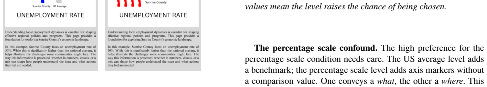
Comparison type drives 58.5 percent of reader preference variation in infographics, while color shows no practical effect.
A machine-rendered reading of the paper's core claim, the machinery that carries it, and where it could break.
Core claim
In the conjoint study, comparison type explained 58.5 percent of the variance in participant choices, graphic type explained 29.2 percent, and color explained 12.3 percent, with participants preferring infographics that included percentage scale markers or benchmark comparisons and showing no practical preference difference between red and blue.
What carries the argument
Choice-based conjoint analysis, which derives relative preference weights from repeated choices between infographic variants that differ on several attributes simultaneously.
If this is right
- Designers should prioritize adding percentage scale markers or benchmark comparisons when creating infographics.
- Choices between red and blue colors are unlikely to change reader preference in practice.
- Bar charts and icon series influence preference more than color but less than comparison features.
- Conjoint analysis provides a method for measuring trade-offs across multiple visualization design dimensions at once.
Where Pith is reading between the lines
- Future studies could separate the benchmark comparison from the percentage scale attribute to determine which element drives the observed preference.
- Results obtained on a single unemployment topic with a limited palette may shift when tested on other data domains such as health statistics or financial data.
- Expanding the participant pool beyond the current sample could test whether the 58.5 percent dominance of comparison type holds across different reader groups.
Load-bearing premise
That the preference weights measured for unemployment infographics using a narrow set of colors and graphic variants will generalize to other topics and design choices.
What would settle it
A replication using different topics or a wider range of colors and graphic options in which color or graphic type explains more preference variance than comparison type.
Figures
read the original abstract
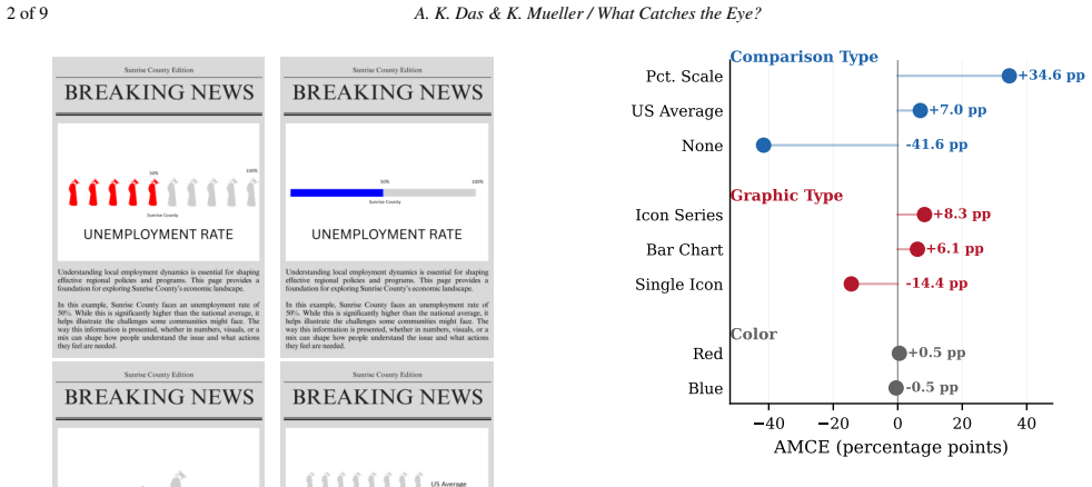
Infographic designers balance many choices at once: chart type, color, and whether to add a benchmark or a scale. Past work studies these factors one at a time, so we know little about how readers weigh them against each other. We address this gap with a choice-based conjoint study (N = 65) in which participants viewed pairs of infographics on a mock newspaper page about unemployment. Each infographic varied across three attributes: comparison type (none, US average, percentage scale), color (red, blue), and graphic type (single icon, icon series, bar chart). Comparison type drove most of the preference variation (58.5%), followed by graphic type (29.2%) and color (12.3%). Readers favored percentage scale markers and benchmark comparisons; color had no practical effect. The percentage scale level adds axis information rather than a benchmark, so the comparison type result mixes two distinct ideas. A single topic and a narrow palette also limit external validity. We argue that conjoint analysis is a practical and underused tool for studying visualization preferences across many design dimensions.
Editorial analysis
A structured set of objections, weighed in public.
Referee Report
Summary. The paper claims that a choice-based conjoint study (N=65) on infographic pairs about unemployment shows comparison type accounting for 58.5% of preference variation, graphic type 29.2%, and color 12.3%, with participants favoring percentage scale markers and benchmark comparisons while color had negligible effect. It positions conjoint analysis as an underused tool for studying visualization design trade-offs and explicitly notes scope limits including conceptual mixing within the comparison-type attribute and restricted external validity from a single topic and narrow palette.
Significance. If the results hold, the work supplies concrete empirical weights for how readers trade off infographic attributes and illustrates conjoint analysis as a scalable method for multi-attribute preference elicitation in visualization research, filling a gap left by one-at-a-time studies. The authors' transparent scoping of limitations strengthens the contribution by clarifying what the percentages can and cannot support.
major comments (1)
- [Abstract / Methods] The abstract (and any corresponding Methods section) reports the attribute importance percentages (58.5/29.2/12.3) and preference orderings but supplies no information on the conjoint model (e.g., multinomial logit vs. hierarchical Bayes), how part-worth utilities were estimated, participant recruitment or screening, or any statistical tests or standard errors around the importances. With N=65 these omissions make it impossible to assess the stability of the central decomposition.
minor comments (1)
- [Abstract] The explicit caveat that the comparison-type attribute mixes benchmark and scale concepts is helpful; moving a brief elaboration of this point into the results or discussion would further clarify interpretation of the 58.5% figure.
Simulated Author's Rebuttal
We thank the referee for the positive assessment and the recommendation of minor revision. The single major comment is addressed point-by-point below.
read point-by-point responses
-
Referee: [Abstract / Methods] The abstract (and any corresponding Methods section) reports the attribute importance percentages (58.5/29.2/12.3) and preference orderings but supplies no information on the conjoint model (e.g., multinomial logit vs. hierarchical Bayes), how part-worth utilities were estimated, participant recruitment or screening, or any statistical tests or standard errors around the importances. With N=65 these omissions make it impossible to assess the stability of the central decomposition.
Authors: We agree that these methodological details are required for readers to evaluate result stability. The submitted manuscript does not contain them. In revision we will add a dedicated Methods subsection specifying the multinomial logit model, maximum-likelihood estimation of part-worth utilities, recruitment via an online panel with attention-check screening, and bootstrap-derived standard errors on the reported importance percentages. revision: yes
Circularity Check
Empirical conjoint study with no circular derivation
full rationale
The paper conducts a standard choice-based conjoint analysis on N=65 participant choices for infographic pairs. Reported importances (58.5% comparison type, 29.2% graphic type, 12.3% color) are direct outputs of the estimation applied to observed preferences. No self-definitional steps, no fitted parameters renamed as independent predictions, and no load-bearing self-citations or uniqueness theorems. Authors explicitly flag scope limits (single topic, narrow palette, mixed comparison attribute). The derivation chain is self-contained against external participant data with no reduction to inputs by construction.
Axiom & Free-Parameter Ledger
Reference graph
Works this paper leans on
-
[1]
[APBB24] ARUNKUMARA., PADILLAL. M. K., BAEG.-Y., BRYAN C.: Image or information? Examining the nature and impact of visual- ization perceptual classification.IEEE Transactions on Visualization and Computer Graphics 30, 1 (2024), 1–11. 2, 7 [Bey26] BEYONDLITERACYAUTHORS: Beyond literacy: Predicting in- terpretation correctness of visualizations with user t...
-
[2]
6 [FPB25] FYGENSONR., PADILLAL., BERTINIE.: Cognitive affor- dances in visualization: Related constructs, design factors, and frame- work. 7 [FWH∗26] FUZ., WANGY., HUANGC., SUNG., LIANGR.: InfoAf- fect: Affective annotations of infographics in information spread. 7 [GGRG09] GALESICM., GARCIA-RETAMEROR., GIGERENZERG.: Using icon arrays to communicate medic...
-
[3]
how good is this visu- alization
exhibit significant gaps with human expert ratings. Our conjoint data capture a complementary signal: not “how good is this visu- alization” but “which design wins in a head to head comparison.” This distinction matters because quality judgments involve absolute evaluation along multiple dimensions, whereas preference reveals relative trade off weights. R...
2026
discussion (0)
Sign in with ORCID, Apple, or X to comment. Anyone can read and Pith papers without signing in.