REVIEW 2 major objections 5 minor 69 references
Seeing Through the Forecast Clutter: Communicating Climate Forecast Distributions with Weighted Multiple Forecast Visualizations
T0 review · 2 major / 5 minor · reviewed 2026-08-15 · deepseek-v4-flash
Pith's one-line read Showing each forecast line separately lets readers identify the true shape of a forecast distribution more accurately than confidence-interval bands do, and weighted line displays preserve that advantage.
desk verdict Well-run, transparent preregistered study, but the headline MFV-over-CI result rests on an acknowledged response-format confound, so the design claim is weaker than the abstract suggests. read the letter →
The pith
A machine-rendered reading of the paper's core claim, the machinery that carries it, and where it could break.
The reading
What carries the argument
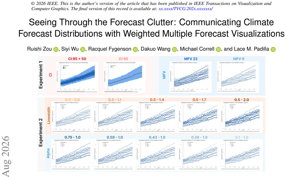
The central object is the multiple forecast visualization (MFV): a line chart that draws each forecast trajectory as its own mark rather than collapsing the set into a summarized band. The argument runs on two perceptual mechanisms. First, preserving individual marks keeps distributional features such as clusters, gaps, multimodality, and skew visible, whereas a confidence-interval band encodes only a center and spread and visually suggests a symmetric bell shape. Second, readers use an extent heuristic, treating the furthest visible edge of the marks as the plausible upper bound, so CI bands that hide outer forecasts lead to narrower perceived ranges than full MFV. The tested variants include a 22-line full display, a 9-line downsample chosen by percentile-based selection, and weighted 9-line displays in which consensus weights computed from a kernel density estimate are mapped to linewidth or opacity, both magnitude channels.
What would settle it
A replication that swaps the answer options so that CI viewers choose among shaded interval bands while MFV viewers choose among line sets, or that uses format-neutral responses such as direct estimates of variance and modality, would settle whether the MFV accuracy advantage survives without format matching; if it disappears or reverses, the paper's central claim is undermined.
Extended reading notes
Core claim
The paper's central claim is that, compared with equivalent confidence-interval plots, multiple forecast visualizations afford a more perceptually accurate foundation when the goal is to communicate both the distribution and the differences of multiple forecasts. In Experiment 1, posterior contrasts showed that MFV 22 produced higher predicted probabilities of correctly identifying the generating distribution (Uniform, Normal, Bimodal, or the original global climate model distribution) than CI 95+50 and CI 95, with the largest effect for the Uniform distribution in Q1 ($\Delta=0.64$, 95% credible interval $[0.43, 0.81]$). CI displays elicited more 'Normal' responses when the true distribution was not normal, and MFV viewers were more likely to select the higher upper-bound point, consistent with an extent heuristic in which readers treat the furthest visible mark as the plausible upper limit. In Experiment 2, weighting a 9-line MFV by consensus-derived opacity or linewidth did not credibly improve distribution identification (hypothesis H4 not supported) but also did not harm it, and the faintest $\alpha$ levels reduced selection of the highest upper-limit response. The authors conclude that summary-based CI displays imply normality and obscure clusters, gaps, and multimodality, whereas downsampled and weighted MFV can communicate additional forecast attributes without sacrificing readers' perception of the underlying forecast distribution.
Load-bearing premise
The load-bearing premise is that the multiple-choice answer options, which were drawn as sets of forecast lines or strip plots in the same visual language as the MFV displays, measure perception of the underlying forecast distribution fairly across all visualization conditions.
Editorial extensions
If this is right
- Forecast graphics that currently use CI bands to summarize model agreement can adopt full MFV, or a 9-line downsample when clutter is a concern, to keep distribution shape visible.
- CI-based displays should be understood as communicating central tendency plus spread, not an accurate rendering of the forecast distribution: they will overstate normality and hide multimodality or clusters.
- Downsampling from 22 to 9 forecasts is a viable decluttering strategy, since distribution perception is largely preserved and visual channels are freed for other attributes.
- Visual weighting by linewidth or opacity can encode model-level attributes such as reliability or consensus without undermining readers' perception of the overall forecast distribution.
- De-emphasizing extreme forecast lines with low opacity shifts readers' upper-limit judgments, so alpha weighting can steer perceived forecast range, an effect linewidth produced less reliably.
Reading between the lines
- Extension: if the normality bias of CI bands is as consistent as Experiment 1 suggests, public forecast graphics that show only a central projection plus a range may systematically overstate model consensus; replacing bands with weighted line sets could reduce the tendency to treat a single pathway as inevitable.
- Extension: a direct test of the paper's acknowledged format-matching limitation would give CI viewers CI-shaped response options and MFV viewers line-set options; if CI accuracy rises to MFV levels, part of the reported advantage is response-option design rather than perceptual fidelity.
- Extension: because the weights were derived from the same distribution being visualized (consensus), the null weighting results leave open whether weights encoding independent attributes, such as historical accuracy, would help or hurt identification; that is the natural next experiment.
- Extension: opacity appears to be the more reliable channel for controlling perceived forecast extent, so designers who want to downweight outlier forecasts should prefer alpha over linewidth until the effect is tested at their own chart sizes and line densities.
Signed reviews
Editorial analysis
A structured set of objections, weighed in public.
Referee Report
Summary. The paper investigates whether multiple forecast visualizations (MFV) communicate underlying forecast distributions more accurately than confidence interval (CI) plots, in the context of climate forecast projections. Two preregistered online experiments are reported. Experiment 1 (480 participants) compares CI 95, CI 95+50, MFV 22, and MFV 9 across four data distributions (Uniform, Normal, Bimodal, GCM) on three tasks: overall distribution identification (Q1), single-year distribution identification at 2099 (Q2), and upper-bound judgment (Q3). Experiment 2 (900 participants) tests weighted MFV 9 variants using linewidth and alpha opacity, relative to a no-weighting baseline. The paper reports that MFV 22, and to a lesser extent MFV 9, lead to more accurate distribution identification and fewer 'Normal' misclassifications than CI plots, while weighted MFV 9 displays generally preserve distribution perception. The authors conclude that MFV affords a more perceptually accurate foundation for communicating both the distribution and the differences of multiple forecasts.
Significance. If the findings hold, the work is practically significant: it offers an evidence-based alternative to CI-based displays for forecast communication, which is relevant to climate reporting, weather prediction, and decision support. The study is well-designed in many respects: both experiments are preregistered, materials and analysis scripts are publicly available, the Bayesian multilevel modeling is appropriate for the multinomial outcome data, and the paper reports contrasts with credible intervals rather than relying solely on p-values. The paper also takes seriously the trade-off between clutter and distributional information by testing a downsampled MFV 9 variant. The main empirical claims are plausible and the authors explicitly acknowledge several limitations, including the response-format matching concern. However, as detailed below, the central claim rests on a measurement confound that needs to be addressed before the conclusion can be accepted at face value.
major comments (2)
- [§4.5 and §7.2] The central claim that MFV is more perceptually accurate than CI is supported primarily by Q1 and Q2, but the response options in both tasks are generated as MFV-style displays: Q1 options are 15 forecast lines and Q2 options are strip plots of 15 values. Participants in CI conditions therefore compare a shaded interval or band to collections of individual lines, while MFV participants compare lines to lines. This format-matching confound affects all H1A–H2D contrasts; if participants are using low-level visual similarity between the stimulus and response options, the observed MFV advantage could be a measurement artifact rather than evidence about the relative perceptual accuracy of the visualization formats. The authors acknowledge this in §7.2 ('we designed the response option for Q1 to have a similar shape to MFV, which might lead participants to use format-matching and advantage the MFV condition') and list it as a limitation, but the limitation is load-bearing for the paper's main conclusion. To support the claim, the paper needs a format-neutral outcome measure (e.g., a task in which response options are matched to the stimulus format for each condition, or a task that does not rely on visual analogies between the stimulus and the answer set), or a supplemental analysis demonstrating that the MFV advantage persists when format-matching is controlled.
- [§4.6 and §6.1] The no-weighting baseline in Experiment 2 is not a concurrent control: the paper states that 'the baseline group of Experiment 2 (no weighting) was taken from Experiment 1.' This means that comparisons between weighting conditions and baseline in H4–H6 are not based on random assignment within the same experiment; they could be confounded by experiment session, recruitment differences, attrition, or subtle differences in administration. This is particularly relevant because the key positive claim of Experiment 2 is that weighting 'preserves' distribution perception (i.e., no harmful effect versus baseline). A null difference against a non-concurrent baseline is weak evidence of preservation. The authors should either analyze Experiment 2 only with participants drawn from the same session, or provide a sensitivity analysis and explicit justification for why the cross-experiment baseline is valid.
minor comments (5)
- [Figure 4] The label 'SSP-8.5' appears to be a typo; it should read 'SSP5-8.5'.
- [§4.6] The text contains garbled superscript text such as '15 90' that appears to be a formatting artifact; please clean these instances.
- [Table 2 and §4.8] H2C and H2D predict similarity between CI and MFV for Normal distributions, but the analysis uses a difference-based categorical regression with no equivalence testing or ROPE criterion. The 'Not supported' interpretation in Table 2 is therefore not a proper evaluation of a similarity hypothesis; consider using an explicit equivalence region or acknowledge that the data only show a directional difference.
- [§4.3] The power-transformation exponent of 1.6 used for consensus weights is stated but not justified; a brief rationale or citation for this value would help reproducibility.
- [§6.1] The phrase 'no consistent proof for H4' is informal; consider 'no consistent evidence for H4'.
Circularity Check
No significant circularity: claims are empirical results from preregistered experiments, and the acknowledged response-format confound is a validity threat, not a definitional reduction.
full rationale
The paper's central claims (MFV improves distribution identification relative to CI; weighting preserves perception) are supported by preregistered behavioral experiments analyzed with Bayesian multilevel models. No step of the argument derives a result from its own input by construction. The term MFV is defined with a citation to the authors' prior work [41], but that citation only names the visualization category and motivates the choice of 9 forecasts; it does not supply the experiment's outcome. The consensus weights in Experiment 2 are computed from the same forecast distribution being displayed, yet the paper explicitly states 'these consensus weights are derived from the same forecast distribution being visualized, they are not independent measures of model quality' (§4.3) and uses them only to test whether weighting disrupts distribution perception, not to validate forecast quality. The strongest candidate concern is the Q1 response-format confound: response options were generated as MFV-style 15-line displays, which could advantage MFV conditions through format matching. The authors acknowledge this directly in §7.2: 'we designed the response option for Q1 to have a similar shape to MFV, which might lead participants to use format-matching and advantage the MFV condition.' This is an honest limitation and a threat to internal validity, but it is not circularity: the MFV-over-CI comparison is not equivalent to the response-option construction by definition, and Q2 provides a complementary strip-plot measure. No fitted parameter is renamed as a prediction, no uniqueness theorem is imported from the authors' prior work to forbid alternatives, and no known result is merely relabeled. The paper is self-contained as an empirical study, so the circularity score is 0.
Assumptions & free parameters
free parameters (5)
- KDE bandwidth for consensus weights =
nrd0 (R default)
- Weight power-transform exponent =
1.6
- Weight rescale ranges =
linewidth 0.5 to 1.4; alpha 0.1 to 1.0
- Alpha and linewidth level sets =
alpha 0.10, 0.26, 0.43, 0.59, 0.75; linewidth 0.8, 1.1, 1.4, 1.7, 2.0
- Bimodal shift and spread parameters =
s: 0 to 1.8 or 0 to 2.5; sigma: varies by scenario
assumptions (6)
- domain assumption Forced-choice responses to MFV-style options are an unbiased measure of perceived forecast distribution across visualization conditions.
- domain assumption Synthetic Normal, Bimodal, and Uniform distributions derived from CMIP6 GCM data preserve the perceptual properties of real forecast distributions.
- domain assumption KDE-based consensus weights are a suitable proxy for forecast-level attributes such as representativeness.
- standard math Bayesian multilevel categorical models with weakly informative priors adequately capture response behavior.
- domain assumption A U.S. representative Prolific sample generalizes to the target audience of climate forecast readers.
- domain assumption Linewidth and opacity are appropriate magnitude channels for encoding forecast weights.
Cite this review
Pith. "Pith review of Seeing Through the Forecast Clutter: Communicating Climate Forecast Distributions with Weighted Multiple Forecast Visualizations." pith.science (2026). https://pith.science/paper/DNTJAE5Z
@misc{pith2026260800433,
  author       = {Pith},
  title        = {Pith review of: Seeing Through the Forecast Clutter: Communicating Climate Forecast Distributions with Weighted Multiple Forecast Visualizations},
  year         = {2026},
  howpublished = {\url{https://pith.science/paper/DNTJAE5Z}},
  note         = {Machine review of arXiv:2608.00433}
}
read the original abstract
Forecasts often diverge because different models make varying assumptions to account for underlying uncertainty. Readers who consume forecasts may wish to survey the shape and spread of these multiple forecasts to get a full account of the different predictions. One approach to visualizing multiple forecasts is through Confidence Interval (CI) plots. However, while the summative CI plots can communicate uncertainty of an ensemble, they obscure attributes of individual forecasts that can lead to inaccurate perceptions of the distribution of these forecasts (e.g., implying a normal distribution when non-existent). To address this challenge, we investigate the use of multiple forecast visualization (MFV) in communicating nuanced forecast distributions through two preregistered experiments using climate forecast data. In Experiment 1 (480 participants), we compared how well MFV and CI plots can represent the distribution of multiple forecasts. We found that, compared to CI plots, MFV improved participants' ability to identify the underlying distribution of forecasts and reduced the likelihood of assuming normality. Building on Experiment 1, we examined in Experiment 2 (900 participants) whether a downsampled MFV showing 9 forecasts might be able to communicate additional forecast properties using linewidth and opacity without negatively impacting distribution perception. We found that visually weighting forecasts by linewidth or opacity preserves readers' perception of the underlying distribution. We discuss how these findings suggest the use of downsampled and weighted MFV to cut through forecast clutter by aligning perceived distribution with the underlying forecast distribution, while opening up design opportunities to use weighting to communicate additional forecast attributes.
Figures


Figures from the paper (5 more)


Reference graph
Works this paper leans on
-
[1]
G. Abramowitz, N. Herger, E. Gutmann, D. Hammerling, R. Knutti, M. Leduc et al. ESD Reviews: Model dependence in multi-model climate ensembles: Weighting, sub-selection and out-of-sample testing.Earth System Dynamics, 10(1):91–105, 2019. doi: 10.5194/esd-10-91-2019 3
-
[2]
B. Bach, F. Chevalier, H.-N. Kostis, M. Subbaro, Y . Jansen, and R. Soden. IEEE VIS Workshop on Visualization for Climate Action and Sustainabil- ity, Apr. 2024. doi: 10.48550/arXiv.2404.02743 3
work page Pith review arXiv doi:10.48550/arxiv.2404.02743 2024
-
[3]
M. T. Ballew, A. Leiserowitz, C. Roser-Renouf, S. A. Rosenthal, J. E. Kotcher, J. R. Marlon et al. Climate Change in the American Mind: Data, Tools, and Trends.Environment: Science and Policy for Sustainable De- velopment, 61(3):4–18, May 2019. doi: 10.1080/00139157.2019.1589300 5
arXiv 2019
-
[4]
N. J. Barrowman and R. A. Myers. Raindrop Plots: A New Way to Display Collections of Likelihoods and Distributions.The American Statistician, 57(4):268–274, Nov. 2003. doi: 10.1198/0003130032369 2
-
[5]
S. Belia, F. Fidler, J. Williams, and G. Cumming. Researchers Misun- derstand Confidence Intervals and Standard Error Bars.Psychological Methods, 10(4):389–396, Dec. 2005. doi: 10.1037/1082-989X.10.4.389 2, 9
-
[6]
https://github.com/breezy-weather/ breezy-weather
Breezy Weather. https://github.com/breezy-weather/ breezy-weather. Accessed: 2026-06-23. 1, 2
work page 2026
-
[7]
Centers for Disease Control and Prevention. COVID-19 Data Visual- ization. https://www.cdc.gov/cfa-modeling-and-forecasting/ covid19-data-vis/index.html. Accessed: 2026-03-20. 1, 2
work page 2026
-
[8]
Understanding Multi-Model Ensembles
ClimateData.ca. Understanding Multi-Model Ensembles. https:// climatedata.ca/resource/multi-model-ensembles/ . Accessed: 2026-03-19. 3
work page 2026
Show all 69 references
-
[9]
M. Correll. Teru Teru B ¯ozu: Defensive Raincloud Plots.Computer Graphics Forum, 42(3):235–246, 2023. doi: 10.1111/cgf.14826 2
2023 doi
-
[10]
Correll and M
M. Correll and M. Gleicher. Error Bars Considered Harmful: Exploring Alternate Encodings for Mean and Error.IEEE Transactions on Visual- ization and Computer Graphics, 20(12):2142–2151, Dec. 2014. doi: 10. 1109/TVCG.2014.2346298 2
2014
-
[11]
Croushore
D. Croushore. Introducing: The Survey of Professional Forecasters.Busi- ness Review - Federal Reserve Bank of Philadelphia, 6:3–15, Nov. 1993. 1, 2
1993
-
[12]
M. D. Dettinger. From Climate-change Spaghetti to Climate-change Distributions for 21st-Century California.San Francisco Estuary and Watershed Science, 3(1), 2005. doi: 10.15447/sfews.2005v3iss1art6 2
2005 doi
-
[13]
https://esgf-metagrid.cloud.dkrz
ESGF Metagrid Search Portal. https://esgf-metagrid.cloud.dkrz. de/search. Accessed: 2026-03-23. 3
2026
-
[14]
Metagrid (Beta): Intro- duction/FAQ
ESGF User Support Working Team. Metagrid (Beta): Intro- duction/FAQ. https://esgf.github.io/esgf-user-support/ metagrid.html, 2019. Accessed: 2025-08-07. 3
2019
-
[15]
G. T. Fechner. Elements of psychophysics, 1860. InReadings in the History of Psychology, Century Psychology Series, pp. 206–213. Appleton- Century-Crofts, East Norwalk, CT, US, 1948. doi: 10.1037/11304-026 4
1948 doi
-
[16]
Survey of Pro- fessional Forecasters
Federal Reserve Bank of Philadelphia. Survey of Pro- fessional Forecasters. https://www.philadelphiafed. org/surveys-and-data/real-time-data-research/ survey-of-professional-forecasters . Accessed: 2026-06-
2026
-
[17]
Fernandes, L
M. Fernandes, L. Walls, S. Munson, J. Hullman, and M. Kay. Uncertainty Displays Using Quantile Dotplots or CDFs Improve Transit Decision- Making. InProceedings of the 2018 CHI Conference on Human Factors in Computing Systems, CHI ’18, pp. 1–12. Association for Computing Ma- ch...
2018
-
[18]
Fygenson, E
R. Fygenson, E. Bertini, and L. M. Padilla. Croissant Charts: Modulating the Performance of Normal Distribution Visualizations with Affordances. Computer Graphics Forum, 2026. doi: 10.1111/cgf.70463 2
2026 doi
-
[19]
Gneiting and A
T. Gneiting and A. E. Raftery. Weather Forecasting with Ensemble Methods.Science, 310(5746):248–249, Oct. 2005. doi: 10.1126/science. 1115255 1
2005 doi
-
[20]
The CMIP6 multi-model ensembles model list
Government of Canada. The CMIP6 multi-model ensembles model list. https://climate-scenarios.canada.ca/?page= cmip6-model-list. Accessed: 2025-08-07. 3
2025
-
[21]
Helske, S
J. Helske, S. Helske, M. Cooper, A. Ynnerman, and L. Besançon. Can Visualization Alleviate Dichotomous Thinking? Effects of Visual Repre- sentations on the Cliff Effect.IEEE Transactions on Visualization and Computer Graphics, 27(8):3397–3409, Aug. 2021. doi: 10.1109/TVCG. 202...
2021
-
[22]
J. M. Hofman, D. G. Goldstein, and J. Hullman. How Visualizing In- ferential Uncertainty Can Mislead Readers About Treatment Effects in Scientific Results. InProceedings of the 2020 CHI Conference on Human Factors in Computing Systems, CHI ’20, pp. 1–12. Association for Com- p...
2020 doi
-
[23]
Hullman, P
J. Hullman, P. Resnick, and E. Adar. Hypothetical Outcome Plots Out- perform Error Bars and Violin Plots for Inferences about Reliability of Variable Ordering.PLOS ONE, 10(11):e0142444, Nov. 2015. doi: 10. 1371/journal.pone.0142444 2
2015
-
[24]
Climate Change 2023: Synthesis Report
IPCC. Climate Change 2023: Synthesis Report. Contribution of Working Groups I, II and III to the Sixth Assessment Report of the Intergovernmen- tal Panel on Climate Change. Technical report, Intergovernmental Panel on Climate Change, Geneva, Switzerland, 2023. doi: 10.59327/IP...
2023 doi
-
[25]
A. Kale, F. Nguyen, M. Kay, and J. Hullman. Hypothetical Outcome Plots Help Untrained Observers Judge Trends in Ambiguous Data.IEEE Transactions on Visualization and Computer Graphics, 25(1):892–902, Jan. 2019. doi: 10.1109/TVCG.2018.2864909 2
2019
-
[26]
Kampstra
P. Kampstra. Beanplot: A boxplot alternative for visual comparison of distributions.Journal of Statistical Software, Code Snippets, 28(1):1–9,
-
[27]
M. Kay, T. Kola, J. R. Hullman, and S. A. Munson. When (ish) is My Bus? User-centered Visualizations of Uncertainty in Everyday, Mobile Predictive Systems. InProceedings of the 2016 CHI Conference on Human Factors in Computing Systems, CHI ’16, pp. 5092–5103. Association for C...
2016
-
[28]
N. Khan, M. A. Nasara, Z. Sa’adi, D. P. Awhari, M. I. Asiri, S. Shahid et al. Global climate models performance: A comprehensive review of applied approaches, recognized issues and possible future directions.Atmospheric Research, 326:108300, Nov. 2025. doi: 10.1016/j.atmosres....
2025
-
[29]
Knutti, R
R. Knutti, R. Furrer, C. Tebaldi, J. Cermak, and G. A. Meehl. Challenges in combining projections from multiple climate models.Journal of Climate, 23(10):2739–2758, 2010. doi: 10.1175/2009JCLI3361.1 3
2010 doi
-
[30]
Knutti, J
R. Knutti, J. Sedláˇcek, B. M. Sanderson, R. Lorenz, E. M. Fischer, and V . Eyring. A climate model projection weighting scheme accounting for performance and interdependence.Geophysical Research Letters, 44(4):1909–1918, 2017. doi: 10.1002/2016GL072012 2, 3, 9
1909 doi
-
[32]
Leiserowitz, J
A. Leiserowitz, J. Kotcher, S. Rosenthal, E. Goddard, J. Carman, M. Verner et al. Climate Change in the American Mind: Beliefs & Attitudes, Fall
-
[33]
L. Liu, A. P. Boone, I. T. Ruginski, L. Padilla, M. Hegarty, S. H. Creem- Regehr et al. Uncertainty Visualization by Representative Sampling from Prediction Ensembles.IEEE Transactions on Visualization and Com- puter Graphics, 23(9):2165–2178, Sept. 2017. doi: 10.1109/TVCG.201...
2017 doi
-
[34]
L. Liu, L. Padilla, S. H. Creem-Regehr, and D. H. House. Visualizing Uncertain Tropical Cyclone Predictions using Representative Samples from Ensembles of Forecast Tracks.IEEE Transactions on Visualization 10 © 2026 IEEE. This is the author’s version of the article that has be...
2026
-
[35]
Ma and A
B. Ma and A. Entezari. An Interactive Framework for Visualization of Weather Forecast Ensembles.IEEE Transactions on Visualization and Computer Graphics, 25(1):1091–1101, Jan. 2019. doi: 10.1109/TVCG. 2018.2864815 2
2019
-
[36]
Mirzargar, R
M. Mirzargar, R. T. Whitaker, and R. M. Kirby. Curve Boxplot: Gen- eralization of Boxplot for Ensembles of Curves.IEEE Transactions on Visualization and Computer Graphics, 20(12):2654–2663, Dec. 2014. doi: 10.1109/TVCG.2014.2346455 2
2014
-
[37]
Munzner.Visualization Analysis and Design
T. Munzner.Visualization Analysis and Design. CRC Press, 2014. doi: 10 .1201/b17511 4
2014
-
[38]
NHC Track and Intensity Models
National Hurricane Center. NHC Track and Intensity Models. https: //www.nhc.noaa.gov/modelsummary.shtml. Accessed: 2026-06-23. 1, 2
2026
-
[39]
Newburger, M
E. Newburger, M. Correll, and N. Elmqvist. Fitting Bell Curves to Data Distributions Using Visualization.IEEE Transactions on Visualization and Computer Graphics, 29(12):5372–5383, Dec. 2023. doi: 10.1109/TVCG. 2022.3210763 2, 6
2023
-
[40]
Y . Okan, E. Janssen, M. Galesic, and E. A. Waters. Using the Short Graph Literacy Scale to Predict Precursors of Health Behavior Change. Medical Decision Making: An International Journal of the Society for Medical Decision Making, 39(3):183–195, Apr. 2019. doi: 10.1177/ 02729...
2019
-
[41]
Padilla, R
L. Padilla, R. Fygenson, S. C. Castro, and E. Bertini. Multiple Forecast Visualizations (MFVs): Trade-offs in Trust and Performance in Multiple COVID-19 Forecast Visualizations.IEEE Transactions on Visualization and Computer Graphics, 29(1):12–22, Jan. 2023. doi: 10.1109/TVCG....
2023
-
[42]
Padilla, H
L. Padilla, H. Hosseinpour, R. Fygenson, J. Howell, R. Chunara, and E. Bertini. Impact of COVID-19 forecast visualizations on pandemic risk perceptions.Scientific Reports, 12(1):2014, Feb. 2022. doi: 10.1038/ s41598-022-05353-1 2
2014
-
[43]
Padilla, M
L. Padilla, M. Kay, and J. Hullman. Uncertainty Visualization. InWiley StatsRef: Statistics Reference Online, pp. 1–18. John Wiley & Sons, Ltd,
-
[44]
L. M. Padilla, R. Fygenson, C. Wilson, K. Potter, and S. C. Castro. Exam- ining Interpretation Strategies for Multiple Forecast Visualizations with Two and Four Forecasts. InProceedings of the 2026 CHI Conference on Human Factors in Computing Systems, CHI ’26, pp. 1–19. Associ...
2026
-
[45]
L. M. Padilla, I. T. Ruginski, and S. H. Creem-Regehr. Effects of ensemble and summary displays on interpretations of geospatial uncertainty data. Cognitive Research: Principles and Implications, 2(1):40, Oct. 2017. doi: 10.1186/s41235-017-0076-1 2
2017 doi
-
[46]
Pandey and A
S. Pandey and A. Ottley. Mini-VLAT: A Short and Effective Measure of Visualization Literacy.Computer Graphics Forum, 42(3):1–11, 2023. doi: 10.1111/cgf.14809 5
2023 doi
-
[47]
Potter, R
K. Potter, R. M. Kirby, D. Xiu, and C. R. Johnson. Interactive visualization of probability and cumulative density functions.International Journal for Uncertainty Quantification, 2(4):397–412, 2012. doi: 10.1615/Int.J. UncertaintyQuantification.2012004074 2
2012 doi
-
[48]
Potter, J
K. Potter, J. Kniss, R. Riesenfeld, and C. Johnson. Visualizing Summary Statistics and Uncertainty.Computer Graphics Forum, 29(3):823–832,
-
[49]
Potter, A
K. Potter, A. Wilson, P.-T. Bremer, D. Williams, C. Doutriaux, V . Pascucci et al. Ensemble-Vis: A Framework for the Statistical Visualization of Ensemble Data. In2009 IEEE International Conference on Data Mining Workshops, pp. 233–240, Dec. 2009. doi: 10.1109/ICDMW.2009.55 2, 6
2009 doi
-
[50]
Accessed: 2026-03-28
Prolific.https://www.prolific.com/. Accessed: 2026-03-28. 5
2026
-
[51]
https: //researcher-help.prolific.com/en/articles/ 445161-what-are-representative-samples-on-prolific , Oct
What are representative samples on Prolific. https: //researcher-help.prolific.com/en/articles/ 445161-what-are-representative-samples-on-prolific , Oct. 2025. Accessed: 2026-06-18. 5
2025
-
[52]
Reichler and J
T. Reichler and J. Kim. How well do coupled models simulate today’s climate?Bulletin of the American Meteorological Society, 89(3):303–312,
-
[53]
I. T. Ruginski, A. P. Boone, L. M. Padilla, L. Liu, N. Heydari, H. S. Kramer et al. Non-expert interpretations of hurricane forecast uncertainty visualizations.Spatial Cognition & Computation, 16(2):154–172, 2016. doi: 10.1080/13875868.2015.1137577 6
2016
-
[54]
Sarma, S
A. Sarma, S. Guo, J. Hoffswell, R. Rossi, F. Du, E. Koh et al. Evaluating the Use of Uncertainty Visualisations for Imputations of Data Missing At Random in Scatterplots.IEEE Transactions on Visualization and Computer Graphics, 29(1):602–612, Jan. 2023. doi: 10.1109/TVCG.2022 ...
2023 doi
-
[55]
Sarma, M
A. Sarma, M. Hedayati, and M. Kay. More Forecasts, More (Decision) Problems: How Uncertainty Representations for Multiple Forecasts Im- pact Decision Making. InProceedings of the 2025 CHI Conference on Human Factors in Computing Systems, CHI ’25, pp. 1–14. Association for Comp...
2025
-
[56]
E. M. Stephens, T. L. Edwards, and D. Demeritt. Communicating proba- bilistic information from climate model ensembles—lessons from numeri- cal weather prediction.WIREs Climate Change, 3(5):409–426, 2012. doi: 10.1002/wcc.187 3
2012 doi
-
[57]
doi: 10.1175/BAMS-89-3-303 3
-
[58]
Stone, D
M. Stone, D. A. Szafir, and V . Setlur. An Engineering Model for Color Difference as a Function of Size.Color and Imaging Conference, 22:253– 258, Nov. 2014. doi: 10.2352/CIC.2014.22.1.art00045 4
2014 doi
-
[59]
S. Tak, A. Toet, and J. van Erp. The Perception of Visual Uncertainty Representation by Non-Experts.IEEE Transactions on Visualization and Computer Graphics, 20(6):935–943, June 2014. doi: 10.1109/TVCG. 2013.247 9
2014 doi
-
[60]
Tebaldi and R
C. Tebaldi and R. Knutti. The use of the multi-model ensemble in proba- bilistic climate projections.Philosophical Transactions of the Royal Soci- ety A: Mathematical, Physical and Engineering Sciences, 365(1857):2053– 2075, June 2007. doi: 10.1098/rsta.2007.2076 3
2007
-
[61]
J. Wang, S. Hazarika, C. Li, and H.-W. Shen. Visualization and Visual Analysis of Ensemble Data: A Survey.IEEE Transactions on Visualization and Computer Graphics, 25(9):2853–2872, Sept. 2019. doi: 10.1109/ TVCG.2018.2853721 1
2019
-
[62]
Sterzik, N
A. Sterzik, N. Lichtenberg, J. Wilms, M. Krone, D. W. Cunningham, and K. Lawonn. Perception of Line Attributes for Visualization.IEEE Transactions on Visualization and Computer Graphics, 30(1):1041–1051, Jan. 2024. doi: 10.1109/TVCG.2023.3326523 4, 12
2024
-
[63]
S. Weart. The development of general circulation models of climate. Studies in History and Philosophy of Science Part B: Studies in History and Philosophy of Modern Physics, 41(3):208–217, Sept. 2010. doi: 10. 1016/j.shpsb.2010.06.002 3
2010
-
[64]
https://www.windy.com/multimodel/
Windy. https://www.windy.com/multimodel/. Accessed: 2026-06-
2026
-
[65]
not supported
R. Zou, S. Wu, R. Fygenson, B. Yao, D. Wang, and L. Padilla. Striking a Balance: Evaluating How Aggregations of Multiple Forecasts Impact Judg- ment Under Uncertainty. In2026 IEEE 19th Pacific Visualization Confer- ence (PacificVis), pp. 165–175, Apr. 2026. doi: 10.1109/Pacifi...
2026
-
[67]
X. Wang, R. J. Hyndman, F. Li, and Y . Kang. Forecast combinations: An over 50-year review.International Journal of Forecasting, 39(4):1518– 1547, Oct. 2023. doi: 10.1016/j.ijforecast.2022.11.005 1
2023 doi
-
[2008]
doi: 10.18637/jss.v028.c01 2
-
[2010]
doi: 10.1111/j.1467-8659.2009.01677.x 2
2009
-
[2021]
doi: 10.1002/9781118445112.stat08296 4
-
[2025]
Technical report, Yale Program on Climate Change Communication, Yale University and George Mason University, New Haven, CT, 2025. 5
2025
Reviewed August 15, 2026 · model on record in the stance chip above.
Discussion (0). Continue with ORCID to comment.