REVIEW 5 major objections 4 minor 2 references
Analyzing the Fine Structure of Distributions
T0 review · 5 major / 4 minor · reviewed 2026-08-14 · deepseek-v4-flash
Pith's one-line read This paper proposes the mirrored density plot and claims it is the only schematic plot among histograms, violin, bean, and ridgeline plots that correctly visualizes uniform, multimodal, skewed, clipped, and differently scaled…
desk verdict A useful and honestly presented visualization tool whose universal-superiority claim is broader than the evidence, with the key weakness acknowledged by the authors themselves. read the letter →
The pith
A machine-rendered reading of the paper's core claim, the machinery that carries it, and where it could break.
The reading
What carries the argument
The central object is the mirrored density plot (MD plot), a symmetric visualization of an estimated univariate probability density. Its engine is Pareto density estimation (PDE), a uniform-kernel method in which the kernel radius is chosen by an information-theoretic optimum: the hypersphere around each point should contain the maximum information per unit volume, which in practice means roughly 20% of the data carry more than 80% of the information. This data-driven radius removes the bandwidth parameter that the paper identifies as the source of misleading default visualizations in histograms, violin, bean, and ridgeline plots. The plot also mirrors the density, overlays a robustly estimated Gaussian when tests indicate unimodality, orders features by shape, and switches to a jittered one-dimensional scatter below size thresholds.
What would settle it
Take a large sample from a known uniform distribution and a known two-component Gaussian mixture with separation just above the dip-test threshold, then run the MD plot over many repetitions; if the MD plot consistently shows a visible mode or waist in the uniform sample, or fails to show a waist in the mixture when Hartigan's dip test is significant, the claim that the MD plot reads these structures correctly is refuted.
Extended reading notes
Core claim
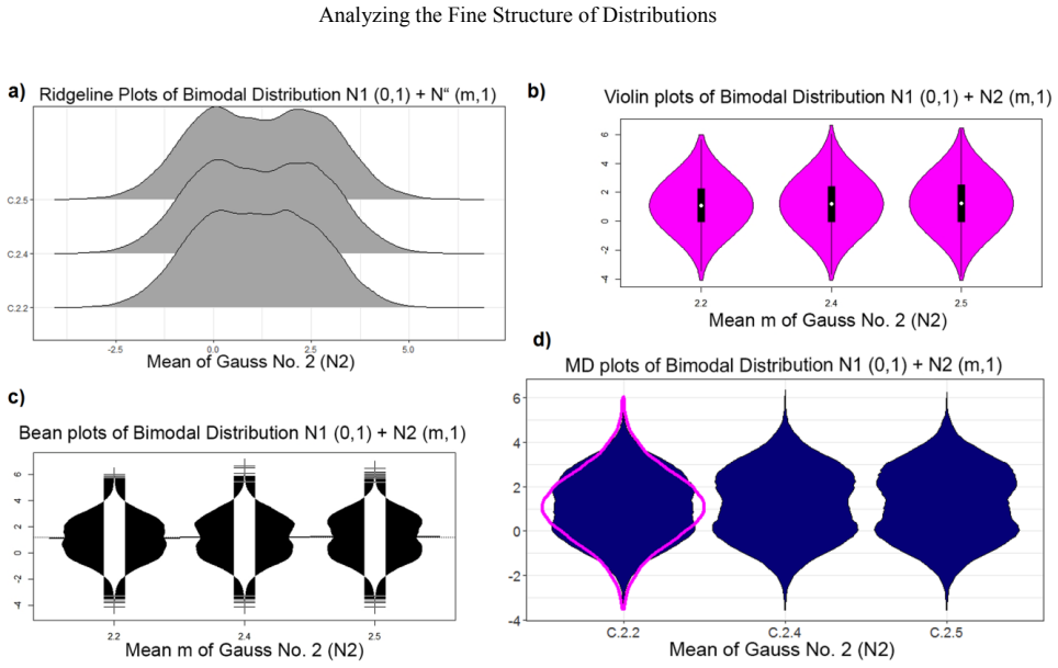
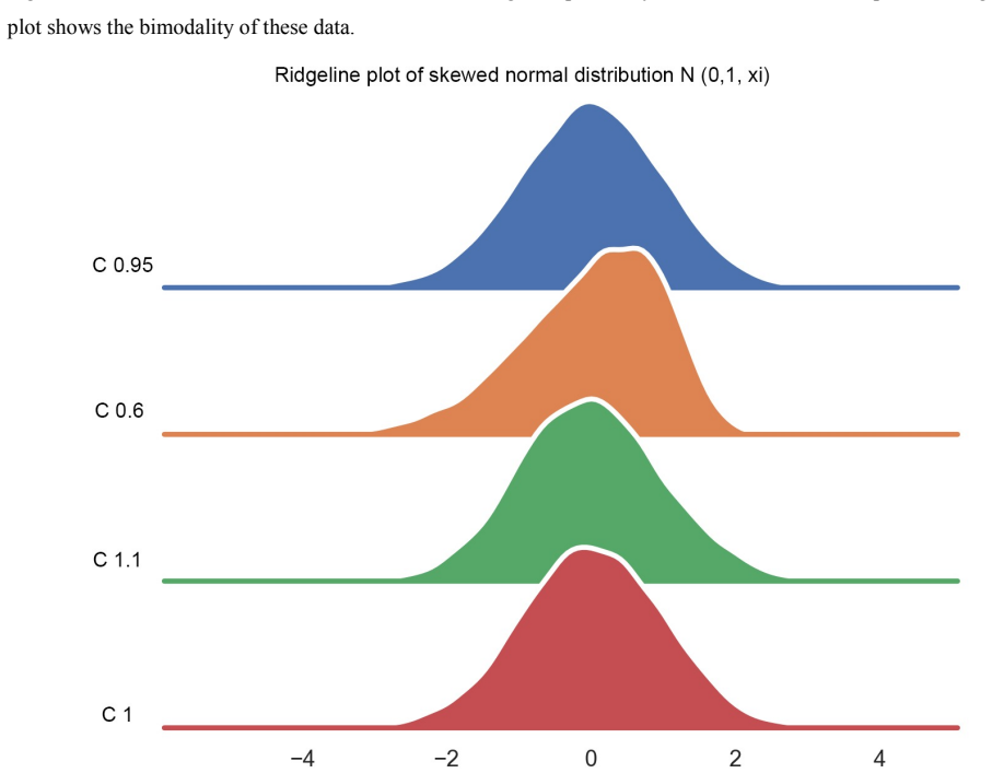
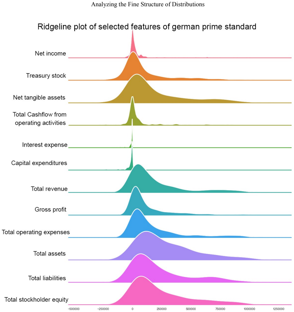
The central claim is that the MD plot is the only schematic plot among the compared ones that is appropriate for every investigated case: it visualizes uniform, bimodal, skewed, clipped, and differently scaled distributions correctly without requiring the user to tune a bandwidth or kernel. The plot builds on Pareto density estimation (PDE), which selects a hypersphere radius by an information-theoretic criterion, and mirrors the estimated density to make multimodality and clipping visible; it can overlay a robustly estimated Gaussian and automatically order features by distribution shape. In experiments with artificial bimodal and skewed samples, natural datasets with known clipping, and twelve financial-statement features, the authors find that the MD plot matches or exceeds the sensitivity of statistical tests and agrees with descriptive statistics where bean and ridgeline plots disagree.
Load-bearing premise
The MD plot's superiority rests on the imported claim that its density estimate, with its automatically chosen radius, is faithful; if that estimate creates modes that are not there or smears density past hard limits, the central 'appropriate for every case' claim fails.
Editorial extensions
If this is right
- If the central claim holds, non-experts can reliably inspect dozens of features at once without choosing density-estimation parameters.
- Default histograms, violin, bean, and ridgeline plots should be read with caution for clipped or skewed data, since they can imply density outside the data range.
- MD plots could serve as a visual companion to Hartigan's dip and D'Agostino skewness tests, matching their sensitivity while showing where the structure is.
- The combination of the MD plot with robust normalization makes distributions with very different ranges comparable in one display.
Reading between the lines
- If PDE's tendency to overestimate multimodality carries over to routine use, the 'roughness' of the mirrored density could be used as a built-in warning flag rather than a failure.
- The MD plot's shape ordering could be turned into a quantitative feature: a scalar summary of each mirrored density could be used to cluster or index features by distribution type.
- Because the MD plot exposes hard cuts at zero, it may be a useful diagnostic for data-generating processes with censoring or floor effects, beyond financial statements.
- A natural stress test would be to compare MD plot mode detection against a fitted Gaussian mixture model with known components on the same samples.
Signed reviews
Editorial analysis
A structured set of objections, weighed in public.
Referee Report
Summary. The paper proposes a new univariate density visualization, the mirrored density plot (MD plot), based on Pareto density estimation (PDE). The MD plot mirrors the estimated density and displays many features in one schematic plot, with optional Gaussian overlays, ordering, scaling, and automatic switching to jittered scatter plots for small or discrete samples. The authors compare MD plots with histograms, violin plots, bean plots, and ridgeline plots on artificial uniform, bimodal, and skewed data, on clipped financial features, and on a 12-feature set from German quarterly financial statements. Hartigan's dip test and D'Agostino's skewness test are used as external sensitivity benchmarks, supported by Monte Carlo iterations. The paper claims that, with default settings, the MD plot outperforms the other methods and is 'the only schematic plot which is appropriate for every case.' R and Python implementations are provided.
Significance. If the universal claim were established, the MD plot would be a genuinely useful tool for exploratory data analysis, particularly for non-expert users. The paper has clear strengths: the artificial experiments are anchored to independent statistical tests; Monte Carlo iterations account for sampling variability; the method is shipped as open-source packages in R and Python; and the authors explicitly acknowledge a possible overestimation of multimodality in PDE. However, the central estimator is imported from prior work and is not independently validated in this manuscript, and the headline claim that the MD plot is appropriate for every case exceeds the evidence presented. The contribution is therefore promising but not yet fully supported.
major comments (5)
- [Methods: Mirrored Density Plot; Discussion] The central claim that the MD plot is 'the only schematic plot which is appropriate for every case' depends on PDE's information-theoretic radius from [11], but this paper neither re-derives nor independently benchmarks that estimator. The Discussion explicitly concedes that PDE 'is specially designed for the detection of multimodality, which could result in an overestimation of multimodality.' The experiments quantify sensitivity to known multimodality and skewness but never quantify false-positive mode detection on uniform or unimodal inputs, so the specificity of the MD plot is unmeasured. This is load-bearing because a mode-inflating density estimator would mislead users precisely in the uniform, clipped, and skewed cases the paper claims to handle correctly.
- [Methods: Mirrored Density Plot; Conclusion; Python package documentation] The manuscript repeatedly describes the MD plot as 'parameter-free' and says it 'does not require adjusting any parameters of density estimation,' yet the method has two thresholds (minimal amount of unique data and minimal amount of values) whose defaults can be changed, and the Python package has a default SampleSize of 500000. The Conclusion even states that the MD plot 'is parameter-free as defined by a data-driven kernel radius,' but the thresholds and sampling parameter are user-visible defaults rather than absent parameters. Because the abstract's non-expert appeal rests on this claim, the wording should be corrected or the thresholds should be shown to have no material effect on the reported visual conclusions.
- [Experiment I, Figs. 2 and 3] The bimodality sensitivity comparison rests on subjective visual inspection ('bimodality is visible starting with a mean equal to 2.4') without a pre-specified detection criterion, a blind evaluation, or a quantitative score of the visual cue. The statement that the MD plot 'makes bimodality visible starting with a mean of 2.2,' while Hartigan's dip test reaches significance only near 2.4, could indicate higher sensitivity, but it could equally be an instance of the PDE mode-overestimation admitted in the Discussion. The manuscript does not test this alternative, so the claimed advantage over statistical testing is not established.
- [Results, Fig. 1] The uniform-distribution case, which is central to the claim that the MD plot does not indicate multimodality where the bean and ridgeline plots do, is based on a single random draw with no quantitative criterion for what constitutes a 'straight line' in the MD plot. The dip test p-value is reported for the sample, but the MD plot's rendering is not scored against the known uniform ground truth, and no repetitions are used. A specificity experiment with many uniform draws and a pre-defined visual-decision rule would be needed to support the claim.
- [Experiment V and Discussion] The financial-data case study is offered as evidence that 'only the MD plots can identify the structure' of the features, but the comparison with descriptive statistics in SI B establishes quantiles, skewness, and kurtosis, not the full distribution shape. The hard cuts and multimodality claimed to be visible in the MD plot are not confirmed by any statistical test, and the ground-truth distribution is unknown. This experiment is a useful illustrative case study, but it cannot by itself support the universal 'every case' claim; it should be framed accordingly.
minor comments (4)
- [Abstract and Introduction] There are typos such as 'For that reason,' (missing capital) in the abstract and 'Morover' in the Introduction that should be corrected.
- [Experiment VI] The phrase 'with an option of the robust normalization [48] that is selected selected in the MD plot' contains a duplicated word.
- [SI F] The R code in SI F includes a bare 'bw' object that appears to be a leftover from processing; as printed, the code chunks will not run without defining it.
- [References] Reference formatting is inconsistent, and the two references [46] and [52] share the same title with different years and venues, which could confuse readers trying to locate the source.
Circularity Check
No significant circularity: the MD plot comparison is anchored to independent statistical tests and descriptive statistics; self-citations to PDE do not define the result.
full rationale
The paper's central claim that the MD plot outperforms histograms, violin, bean, and ridgeline plots is not derived from the MD plot itself. The evaluations in Experiments I and II are anchored to Hartigan's dip test and the D'Agostino skewness test, which are independent of the proposed method, and Experiment V is checked against descriptive statistics in SI B rather than against the MD plot's own output. The MD plot does import the Pareto density estimator from the authors' prior work [11], and this is load-bearing for the 'parameter-free' property, but [11] is a published estimator that is externally falsifiable and is tested here against known artificial distributions and independent statistical benchmarks; no equation or fitted parameter in this paper reduces by construction to the claimed result. The Discussion's admission that PDE 'could result in an overestimation of multimodality' is a correctness caveat about the estimator's behavior, not evidence that the benchmark comparisons are definitional. Self-citations to prior published PDFs ([49], [17]) supply externally checkable ground-truth models, and those models were not fitted to the MD plot's predictions. No uniqueness theorem or ansatz is smuggled in via citation, and no known empirical pattern is merely renamed. The universal claim 'appropriate for every case' is broader than the evidence, which is a correctness risk, but the derivation chain itself is not circular.
Assumptions & free parameters
free parameters (2)
- MD plot unique-data and minimum-sample thresholds =
default, not numerically specified in the paper
- SampleSize for large datasets =
500000 (Python package section 3.2)
assumptions (6)
- domain assumption PDE radius selection from [11] yields a faithful density estimate with no user-set bandwidth.
- domain assumption A hypersphere containing about 20% of the data carries more than 80% of the possible information.
- domain assumption Hartigan's dip test and D'Agostino's skewness test are the correct external ground truth for multimodality and skewness.
- domain assumption Results for sample sizes in the tested range 269 to 31,000 generalize to other sample sizes.
- domain assumption The 'known PDFs' of natural datasets from prior publications are correct ground truth.
- domain assumption The descriptive statistics table in SI B accurately captures the true structure of the financial features.
Cite this review
Pith. "Pith review of Analyzing the Fine Structure of Distributions." pith.science (2026). https://pith.science/paper/F6KFM35O
@misc{pith2026190806081,
  author       = {Pith},
  title        = {Pith review of: Analyzing the Fine Structure of Distributions},
  year         = {2026},
  howpublished = {\url{https://pith.science/paper/F6KFM35O}},
  note         = {Machine review of arXiv:1908.06081}
}
read the original abstract
One aim of data mining is the identification of interesting structures in data. For better analytical results, the basic properties of an empirical distribution, such as skewness and eventual clipping, i.e. hard limits in value ranges, need to be assessed. Of particular interest is the question of whether the data originate from one process or contain subsets related to different states of the data producing process. Data visualization tools should deliver a clear picture of the univariate probability density distribution (PDF) for each feature. Visualization tools for PDFs typically use kernel density estimates and include both the classical histogram, as well as the modern tools like ridgeline plots, bean plots and violin plots. If density estimation parameters remain in a default setting, conventional methods pose several problems when visualizing the PDF of uniform, multimodal, skewed distributions and distributions with clipped data, For that reason, a new visualization tool called the mirrored density plot (MD plot), which is specifically designed to discover interesting structures in continuous features, is proposed. The MD plot does not require adjusting any parameters of density estimation, which is what may make the use of this plot compelling particularly to non-experts. The visualization tools in question are evaluated against statistical tests with regard to typical challenges of explorative distribution analysis. The results of the evaluation are presented using bimodal Gaussian, skewed distributions and several features with already published PDFs. In an exploratory data analysis of 12 features describing quarterly financial statements, when statistical testing poses a great difficulty, only the MD plots can identify the structure of their PDFs. In sum, the MD plot outperforms the above mentioned methods.
Figures


Figures from the paper (16 more)





Reference graph
Works this paper leans on
-
[1]
[Thrun/Ultsch, 2019] Thrun, M. C., & Ultsch, A.: Analyzing the Fine Structure of Distributions, Technical Report of the University of Marburg,
work page 2019
-
[2019]
[Thrun et al., 2018] Thrun, M. C.,Pape, Felix, Hansen-Goos, Onno, & Ultsch A.: DataVisualizations: Visualizations of High-Dimensional Data, R package available on CRAN: https://CRAN.R-project.org/package=DataVisualizations, 2018
work page 2018
Reviewed August 14, 2026 · model on record in the stance chip above.
Discussion (0). Continue with ORCID to comment.