EpiCurveBench: Evaluating VLMs on Epidemic Curve Digitization
Pith reviewed 2026-06-29 18:28 UTC · model grok-4.3
The pith
Vision-language models reach at most 52.3 percent accuracy extracting epidemic curves when evaluated with a metric that preserves temporal order.
A machine-rendered reading of the paper's core claim, the machinery that carries it, and where it could break.
Core claim
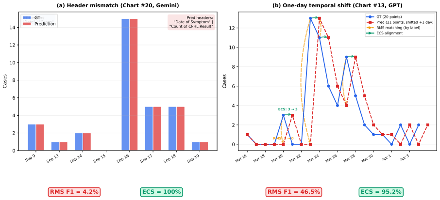
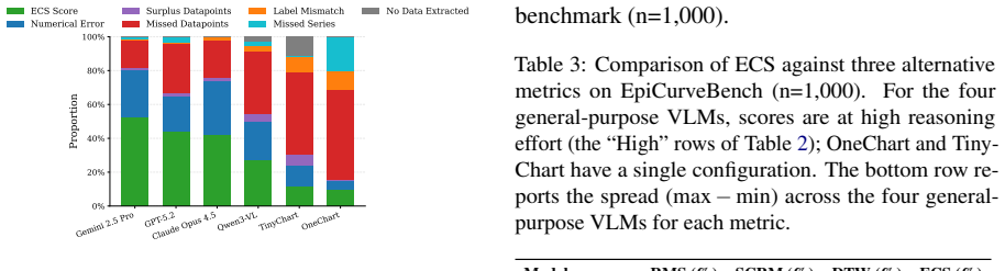
EpiCurveSimilarity aligns predicted and ground-truth epidemic curves via dynamic programming, penalizing local shifts and gaps proportionally rather than treating points as unordered pairs. On the 1,000-image benchmark the strongest model attains 52.3 percent ECS; the same models differ by only five points under RMS or SCRM. ECS scores correlate more strongly than Dynamic Time Warping with accuracy on total-case counts, peak timing, peak height, and growth-rate estimates.
What carries the argument
EpiCurveSimilarity (ECS), a dynamic-programming alignment that tolerates bounded temporal shifts and gaps while applying proportional penalties.
If this is right
- Models with higher ECS produce smaller errors in total case counts, peak timing, peak magnitude, and growth-rate estimates.
- ECS separates general-purpose vision-language models across a 25-point range while unordered metrics separate them across only five points.
- ECS correlates 1.5 to 3.6 times more strongly with the four epidemiological summary statistics than Dynamic Time Warping.
- The same benchmark and metric apply to any structured time-series chart extraction task beyond epidemic curves.
Where Pith is reading between the lines
- A 52 percent ceiling suggests that current vision-language architectures may need explicit temporal-structure modules to reach usable accuracy on scientific figures.
- If ECS proves predictive in other domains, it could replace unordered key-value metrics for any ordered chart data such as stock prices or climate records.
- Unlocking decades of published epidemic figures at scale would supply new historical training data for outbreak models.
Load-bearing premise
Dynamic-programming alignment with proportional gap and shift penalties correctly measures how useful an extracted curve will be for epidemiological analysis.
What would settle it
A model that scores low on ECS yet produces smaller errors than a high-ECS model on total counts, peak timing, peak magnitude, and growth-rate fidelity would falsify the claim.
Figures
read the original abstract
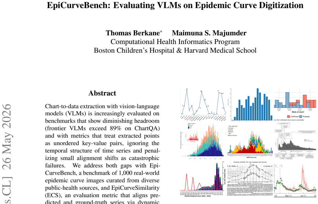
Chart-to-data extraction with vision-language models (VLMs) is increasingly evaluated on benchmarks that show diminishing headroom (frontier VLMs exceed 89% on ChartQA) and with metrics that treat extracted points as unordered key-value pairs, ignoring the temporal structure of time series and penalizing small alignment shifts as catastrophic failures. We address both gaps with EpiCurveBench, a benchmark of 1,000 real-world epidemic curve images curated from diverse public-health sources, and EpiCurveSimilarity (ECS), an evaluation metric that aligns predicted and ground-truth series via dynamic programming, tolerating local temporal shifts and gaps while penalizing them proportionally. Evaluating six methods--three frontier closed VLMs, one open VLM, and two specialized chart-extraction systems--we find the strongest model reaches only 52.3% ECS, and that ECS spreads the four general-purpose VLMs over a 25-point range where key-value metrics (RMS, SCRM) compress them into a 5-point band. We further validate ECS against four downstream epidemiological summary statistics, finding that higher ECS predicts smaller errors in total counts, peak timing, and peak magnitude, and higher growth-rate fidelity; across all four, ECS correlates 1.5--3.6 times more strongly than Dynamic Time Warping, which lacks a gap penalty and therefore cannot distinguish a truncated prediction from a temporally faithful one. EpiCurveBench targets a high-impact public-health application--unlocking decades of outbreak data trapped in published figures--but the benchmark and metric apply directly to any structured time-series chart-extraction setting.
Editorial analysis
A structured set of objections, weighed in public.
Referee Report
Summary. The manuscript introduces EpiCurveBench, a benchmark of 1,000 curated epidemic curve images from public-health sources, and EpiCurveSimilarity (ECS), a dynamic-programming metric that aligns predicted and ground-truth time series while tolerating shifts and gaps with proportional penalties. It evaluates six methods (three frontier closed VLMs, one open VLM, two specialized systems), finding the best ECS score of 52.3%, that ECS provides greater discrimination among general-purpose VLMs (25-point range) than RMS or SCRM (5-point range), and that ECS correlates 1.5-3.6 times more strongly than DTW with four downstream epidemiological statistics (total counts, peak timing, peak magnitude, growth-rate fidelity).
Significance. If the reported results and validation hold upon detailed inspection, the work provides a valuable benchmark and metric for time-series chart extraction tasks, particularly relevant to public health applications involving digitization of historical epidemic data. The explicit validation of ECS against downstream utility metrics is a strength, addressing a common weakness in evaluation metrics for structured outputs.
major comments (4)
- [Methods] Methods: The criteria for curating the 1,000 images from diverse public-health sources are not specified, including any filtering for image quality, resolution, or epidemic type; this is load-bearing for assessing the benchmark's representativeness and reproducibility of the evaluation results.
- [Methods] Methods: The exact dynamic-programming implementation for ECS, including the specific proportional gap and shift penalty values and the alignment algorithm details, is not provided; without this, the reported 52.3% score and the correlation comparisons cannot be independently verified.
- [Results] Results: No error bars, confidence intervals, or statistical significance tests are reported for the ECS scores, the separation ranges, or the correlation coefficients with downstream statistics; this undermines the strength of the claim that ECS is 1.5-3.6 times more strongly correlated than DTW.
- [Validation] Validation: Details on how the four downstream epidemiological summary statistics are computed from the extracted series and how the correlations are calculated (e.g., Pearson or Spearman, across what sample) are missing, which is central to the validation that ECS better predicts downstream utility.
minor comments (1)
- [Abstract] Abstract: The abstract mentions 'six methods--three frontier closed VLMs, one open VLM, and two specialized chart-extraction systems' but does not name them; naming would improve clarity.
Simulated Author's Rebuttal
We thank the referee for their thoughtful and constructive comments, which highlight important areas for improving the clarity, reproducibility, and statistical rigor of the manuscript. We address each major comment below and will incorporate revisions to strengthen the paper.
read point-by-point responses
-
Referee: [Methods] Methods: The criteria for curating the 1,000 images from diverse public-health sources are not specified, including any filtering for image quality, resolution, or epidemic type; this is load-bearing for assessing the benchmark's representativeness and reproducibility of the evaluation results.
Authors: We agree that explicit curation criteria are essential for reproducibility and assessing representativeness. In the revised manuscript, we will add a dedicated subsection in Methods detailing the data sources (specific public-health repositories and journals), selection process, quality filters (e.g., minimum resolution of 300 dpi, legible axes and labels, no excessive occlusion), and diversity criteria (epidemic types, geographic regions, time periods). We will also release the full list of image sources and curation metadata with the benchmark. revision: yes
-
Referee: [Methods] Methods: The exact dynamic-programming implementation for ECS, including the specific proportional gap and shift penalty values and the alignment algorithm details, is not provided; without this, the reported 52.3% score and the correlation comparisons cannot be independently verified.
Authors: We acknowledge this omission limits independent verification. The revised Methods section will include the full dynamic programming recurrence relation, the exact proportional penalty formulations (gap penalty scaled by series length, shift penalty per time step), and all hyperparameter values used. We will also release the complete ECS implementation code (with the benchmark) to enable exact reproduction of the 52.3% score and all correlation results. revision: yes
-
Referee: [Results] Results: No error bars, confidence intervals, or statistical significance tests are reported for the ECS scores, the separation ranges, or the correlation coefficients with downstream statistics; this undermines the strength of the claim that ECS is 1.5-3.6 times more strongly correlated than DTW.
Authors: We agree that statistical quantification would strengthen the claims. In the revision, we will add bootstrap-derived 95% confidence intervals for all ECS scores and correlation coefficients. We will also apply appropriate significance tests (e.g., Steiger's test for comparing dependent correlations) to evaluate whether the 1.5-3.6x improvement of ECS over DTW is statistically significant, reporting these in the Results section. revision: yes
-
Referee: [Validation] Validation: Details on how the four downstream epidemiological summary statistics are computed from the extracted series and how the correlations are calculated (e.g., Pearson or Spearman, across what sample) are missing, which is central to the validation that ECS better predicts downstream utility.
Authors: We will expand the Validation subsection to provide precise definitions and formulas: total count as the sum of the series values; peak timing as the time index of the maximum value; peak magnitude as the maximum value; growth-rate fidelity as the R² of a linear fit to the log-transformed series. Correlations will be specified as Pearson (with sample size n=1000 per model) and computed between per-image ECS/DTW scores and the absolute error in each statistic. These details will be added to clarify the validation. revision: yes
Circularity Check
No significant circularity detected
full rationale
The paper introduces EpiCurveBench as a curated dataset of 1000 images and defines ECS explicitly as a dynamic-programming alignment metric with proportional gap and shift penalties; this definition is independent of the model outputs or downstream statistics. Model performance is measured directly on the benchmark (max 52.3% ECS), and ECS is validated by computing its correlation with four external epidemiological summary statistics (total count error, peak timing, peak magnitude, growth-rate fidelity), where it outperforms DTW by a factor of 1.5–3.6. No equations reduce ECS scores to fitted parameters, no self-citations serve as load-bearing premises, and no ansatz or uniqueness claim is smuggled in; the derivation chain consists of an externally verifiable metric definition plus direct empirical comparison against held-out downstream quantities.
Axiom & Free-Parameter Ledger
axioms (1)
- standard math Dynamic programming can align two time series while tolerating and penalizing local shifts and gaps
Reference graph
Works this paper leans on
-
[1]
Qwen3-vl technical re- port.Preprint, arXiv:2511.21631. Logan C. Brooks, David C. Farrow, Sangwon Hyun, Ryan J. Tibshirani, and Roni Rosenfeld
work page internal anchor Pith review Pith/arXiv arXiv
-
[2]
Onechart: Purify the chart structural extraction via one auxiliary token. Preprint, arXiv:2404.09987. Lei Chen and Raymond Ng
-
[3]
In2019 International Conference on Document Analysis and Recognition (ICDAR), pages 1563–1570
Icdar 2019 competition on scene text visual ques- tion answering. In2019 International Conference on Document Analysis and Recognition (ICDAR), pages 1563–1570. Google
2019
-
[4]
https: //blog.google/innovation-and-ai/ models-and-research/google-deepmind/ gemini-model-thinking-updates-march-2025/
Gemini 2.5: Our most intelligent ai model. https: //blog.google/innovation-and-ai/ models-and-research/google-deepmind/ gemini-model-thinking-updates-march-2025/ . Chengzhi Liu, Zhongxing Xu, Qingyue Wei, Juncheng Wu, James Zou, Xin Eric Wang, Yuyin Zhou, and Sheng Liu
2025
-
[5]
More thinking, less seeing? assess- ing amplified hallucination in multimodal reasoning models.Preprint, arXiv:2505.21523. Fangyu Liu, Julian Eisenschlos, Francesco Piccinno, Syrine Krichene, Chenxi Pang, Kenton Lee, Man- dar Joshi, Wenhu Chen, Nigel Collier, and Yasemin Altun. 2023a. DePlot: One-shot visual language rea- soning by plot-to-table translati...
-
[6]
Chartqapro: A more diverse and challenging benchmark for chart question answering. Preprint, arXiv:2504.05506. Ahmed Masry, Do Xuan Long, Jia Qing Tan, Shafiq Joty, and Enamul Hoque
-
[7]
ChartQA: A Benchmark for Question Answering about Charts with Visual and Logical Reasoning
Chartqa: A benchmark for question answering about charts with visual and logical reasoning.Preprint, arXiv:2203.10244. Nitesh Methani, Pritha Ganguly, Mitesh M. Khapra, and Pratyush Kumar
work page internal anchor Pith review Pith/arXiv arXiv
- [8]
-
[9]
DINOv2: Learning Robust Visual Features without Supervision
DINOv2: Learning ro- bust visual features without supervision.Preprint, arXiv:2304.07193. Yasaman Razeghi, Ishita Dasgupta, Fangyu Liu, Vinay Venkatesh Ramasesh, and Sameer Singh
work page internal anchor Pith review Pith/arXiv arXiv
-
[10]
InFindings of the Association for Computational Linguistics: EMNLP 2024, pages 5922–5937, Miami, Florida, USA
Plot twist: Multimodal models don’t comprehend simple chart details. InFindings of the Association for Computational Linguistics: EMNLP 2024, pages 5922–5937, Miami, Florida, USA. Association for Computational Linguistics. Ankit Rohatgi. Webplotdigitizer. Hiroaki Sakoe and Seibi Chiba
2024
-
[11]
Charxiv: Charting gaps in realistic chart understanding in multimodal llms.Preprint, arXiv:2406.18521. Renqiu Xia, Haoyang Peng, Hancheng Ye, Mingsheng Li, Xiangchao Yan, Peng Ye, Botian Shi, Yu Qiao, Junchi Yan, and Bo Zhang
-
[12]
Structchart: On the schema, metric, and augmentation for visual chart understanding.Preprint, arXiv:2309.11268. Xiang Yue, Yuansheng Ni, Kai Zhang, Tianyu Zheng, Ruoqi Liu, Ge Zhang, Samuel Stevens, Dongfu Jiang, Weiming Ren, Yuxuan Sun, Cong Wei, Botao Yu, Ruibin Yuan, Renliang Sun, Ming Yin, Boyuan Zheng, Zhenzhu Yang, Yibo Liu, Wenhao Huang, and 3 others
-
[13]
InProceedings of the 2024 Conference on Em- pirical Methods in Natural Language Processing, pages 1882–1898, Miami, Florida, USA
TinyChart: Efficient chart understanding with program-of-thoughts learning and visual token merg- ing. InProceedings of the 2024 Conference on Em- pirical Methods in Natural Language Processing, pages 1882–1898, Miami, Florida, USA. Association for Computational Linguistics. A Extraction Prompt All four general-purpose VLMs were evaluated with the followi...
2024
-
[14]
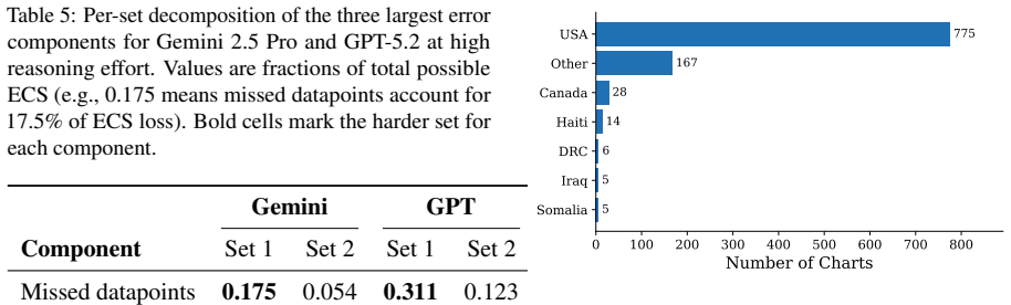
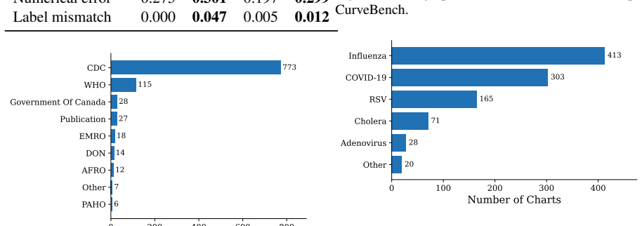
D Source, Country, and Disease Distribution Figure 4 shows the distribution of sources
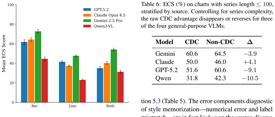
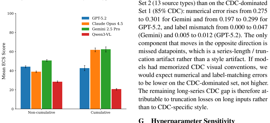
for the two strongest general-purpose VLMs, supporting the analysis in Sections 5.3 and F. D Source, Country, and Disease Distribution Figure 4 shows the distribution of sources. Fig- ure 5 shows the geographic distribution of charts. Figure 6 shows the distribution of diseases. 10 Table 5: Per-set decomposition of the three largest error components for G...
-
[15]
This suggests that the raw CDC vs
After complexity matching, the CDC advantage shrinks substantially and reverses for three of the four general-purpose VLMs, which in fact perform betteron non-CDC charts of equivalent length; only Claude Opus 4.5 retains a small residual CDC advantage (+4.1 ECS). This suggests that the raw CDC vs. non-CDC gap is driven primarily by series length, not by o...
2022
discussion (0)
Sign in with ORCID, Apple, or X to comment. Anyone can read and Pith papers without signing in.