REVIEW 4 major objections 6 minor 5 cited by
IGenBench: Benchmarking the Reliability of Text-to-Infographic Generation
T0 review · 4 major / 6 minor · reviewed 2026-08-03 · deepseek-v4-flash
Pith's one-line read IGenBench decomposes infographic reliability into atomic yes/no questions and finds that even the strongest text-to-image model passes only 49% of infographics end-to-end.
desk verdict First real reliability benchmark for text-to-infographic generation with careful curation and interpretable metrics, but evaluator validation is weaker than it looks and the sampling algorithm doesn't produce the stated size. read the letter →
The pith
A machine-rendered reading of the paper's core claim, the machinery that carries it, and where it could break.
The reading
What carries the argument
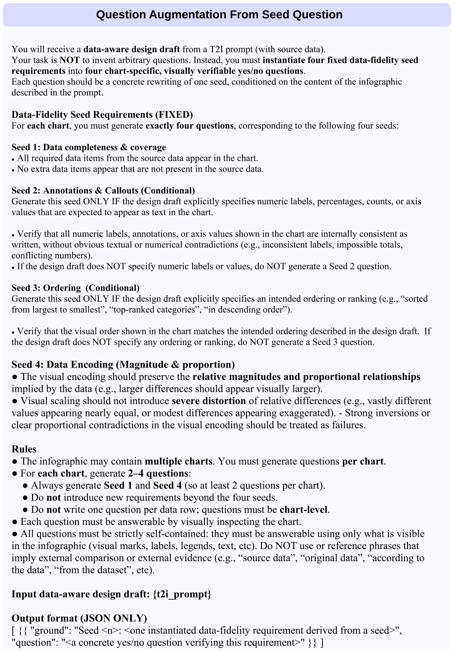
The carrying mechanism is the atomic question set. Each of the 600 prompts is decomposed—with expert-informed augmentation for data completeness, data ordering, and data encoding—into self-contained yes/no questions organized under a 10-type taxonomy covering titles, chart type, data marks, axes, legends, annotations, decorative elements, and data-level properties. The evaluator scores each generated infographic with a strict binary rule where ambiguity or partial satisfaction counts as failure, and the two aggregation metrics Q-ACC and I-ACC turn those answers into interpretable reliability scores. The strict binary scoring and the gap between the two metrics are what make reliability measu
What would settle it
Have three or more human annotators answer every atomic question for a random sample of roughly 200 generated infographics (not averaged subsets), then recompute model-level Q-ACC, I-ACC, and dimension-level scores. If the automated evaluator's misses on Data Encoding are not roughly uniform across models, or if human judgments put a second-tier model's I-ACC well above 0.06, the specific tier boundaries and the data-fidelity-bottleneck conclusion would not survive.
Extended reading notes
Core claim
The central discovery is that infographic reliability can be decomposed into atomic, verifiable constraints and measured by two complementary scores: Q-ACC, the fraction of individual constraints satisfied, and I-ACC, the fraction of infographics that satisfy all constraints simultaneously. Under this decomposition, current text-to-image models form a three-tier hierarchy—Nanobanana-Pro at 0.90 Q-ACC / 0.49 I-ACC, Seedream-4.5 and GPT-Image-1.5 in a middle tier at 0.61 / 0.06 and 0.55 / 0.12, and all remaining models below 0.48 Q-ACC—with data-related dimensions as the universal bottleneck. The paper argues that high component-level accuracy coexists with long-tail failures: a single missed
Load-bearing premise
The benchmark's numbers stand or fall on the assumption that the chosen MLLM evaluator's binary answers to the atomic questions are valid ground truth; the paper's own error analysis shows the largest evaluator-human disagreement is on Data Encoding (12.12%), where the evaluator tends to miss violations, so if those misses are uneven across models the tier ranking and bottleneck ordering could shift.
Editorial extensions
If this is right
- Even the strongest model fails more than half of full infographics, so human verification and post-editing remain necessary before generated infographics can be used in business, education, or journalism.
- Data fidelity is the universal bottleneck: Data Completeness averages 0.21, Data Ordering 0.27, and Data Encoding 0.26 across all tested models, far below scores for titles, chart types, and decorative elements.
- Q-ACC alone overstates readiness; I-ACC should be reported alongside it whenever end-to-end correctness matters, because a single missed constraint can invalidate an entire infographic.
- Infographic reliability is a distinct capability from natural-image generation: model rankings on infographic checks do not always match rankings on general image-quality arenas.
- The 5,259-question protocol offers a reusable, interpretable evaluation route for future models, with question-level scores identifying exactly which dimension to improve.
Reading between the lines
- Beyond the paper: with typically 7–11 checks per infographic, the observed 0.90 Q-ACC / 0.49 I-ACC pair is close to what independent per-question errors would predict (0.9^7 is about 0.48), suggesting the full-infographic failure rate is mostly a compounding-error effect rather than a separate failure mode.
- Beyond the paper: the evaluator's known blind spot on Data Encoding (12.12% disagreement with humans, mostly missed violations) suggests a hybrid evaluation that adds programmatic geometric checks—comparing detected bar heights, circle areas, or polygon sizes to the stated values—would harden the benchmark and could change model ordering on the very dimension the paper identifies as the bottleneck
- Beyond the paper: a testable consequence of the bottleneck claim is that training or fine-tuning on data-fidelity objectives should raise I-ACC faster than aesthetic-oriented improvements; comparing two models matched on Q-ACC but differing in encoding-specific training would test this directly.
Editorial analysis
A structured set of objections, weighed in public.
Referee Report
Summary. The paper introduces IGenBench, a benchmark for evaluating the reliability of text-to-infographic generation. It curates 600 test cases from 42k real infographics across 30 chart types, decomposes reliability verification into 5,259 atomic yes/no questions over a 10-type taxonomy, and proposes Q-ACC and I-ACC metrics. Ten T2I models are evaluated with Gemini-2.5-Pro as the automated verifier. The main claims are a three-tier performance hierarchy (top model Q-ACC 0.90, I-ACC 0.49), universal data-related bottlenecks (Data Completeness 0.21, Data Encoding 0.26, Ordering 0.27), and the overall unreliability of current models for autonomous infographic generation. The paper also reports a human-LLM subset-average correlation of r=0.90 and a leakage sensitivity experiment in the appendix.
Significance. If the evaluator-validity concern is resolved, IGenBench would be a valuable contribution: it is the first dedicated benchmark for text-to-infographic reliability; the dataset construction is careful (real-world provenance, manual verification of extracted data and intent, diversity-aware sampling); the question taxonomy is interpretable; and the protocol is transparent, with prompts and case studies included in the appendix. The leakage sensitivity check in Appendix D.2 is a welcome addition, and the distinction between Q-ACC and I-ACC is well motivated. The reported findings, if robust, would give the community concrete model rankings and a diagnostic tool. However, the central quantitative conclusions currently rest on the validity of a single MLLM evaluator, and the evidence for that validity is not yet strong enough to support the specific tier boundaries and bottleneck ordering claimed in the paper.
major comments (4)
- [§5.3, Appendix D.3, Table 1] The evaluator is validated only through correlation of 100 subset averages (r=0.90). This does not validate individual yes/no judgments and can mask category- or model-dependent bias. Appendix D.3 reports the largest disagreement is on Data Encoding (12.12%), predominantly over-positive errors where Gemini-2.5-Pro misses encoding violations. Data Encoding is one of the headline bottlenecks in Table 1 (average 0.26), so such bias could change the ordering of data-related bottlenecks and could inflate Q-ACC gaps if the false-positive rate varies by model. Please report per-question confusion matrices by question category and by model, with the number of human-annotated questions, and show the sensitivity of Table 1's rankings to a correction based on this confusion matrix.
- [Table 1, §5.2] Table 1 reports Q-ACC and I-ACC as point estimates with no confidence intervals, standard errors, or significance tests. The three-tier hierarchy separates models by gaps as small as 0.07 (Seedream-4.5 0.61 vs GPT-Image-1.5 0.55 vs Nanobanana 0.48), and many I-ACC values are exactly 0.00. Because the central claims depend on these tier boundaries, I-ACC's sensitivity to a single erroneous question, and the absence of uncertainty are load-bearing. Add bootstrap 95% CIs over test cases and, where tier distinctions are claimed, paired model comparisons or at least overlap checks.
- [Appendix D.2, Table 1] The leakage experiment shows GPT-Image-1.5's Q-ACC drops from 0.52 on the original benchmark to 0.29 on infographics published after December 2025, a 44% relative drop. Yet Table 1 and §5.2 report GPT-Image-1.5 as second tier (Q-ACC 0.55, I-ACC 0.12) with no caveat. Since the model hierarchy is a central claim, either exclude or clearly flag leakage-affected scores in the main results and state which tier conclusions are robust to this contamination.
- [Appendix D.3, Figure 10] The error analysis reports disagreement rates (e.g., 12.12% for Data Encoding, 0% for Ordering) but does not state the sample size, the number of questions or images annotated, or whether the disagreements are computed on all 5,259 questions or a subset. The claim that 'categories such as Title & Subtitle, Data Completeness, and Ordering demonstrate near-perfect agreement' may be an artifact of a small denominator. Please provide the exact counts and, if the analysis is on a subset, the sampling procedure.
minor comments (6)
- [Table 1] The header row of Table 1 appears mangled (e.g., 'Comp./code', 'Enc./char', 'char◎-line', 'list-ul'). It should be replaced with explicit, readable question-type names (Data Completeness, Data Encoding, Data Ordering, etc.).
- [§5.2] The sentence 'Data Completeness shows the lowest average performance at 0.21, followed by Ordering (0.27) and Data Encoding (0.26)' is ordered incorrectly; the second-lowest is Data Encoding (0.26), then Ordering (0.27).
- [§2] The text refers to 'MatplotBench (Yang et al., 2024b)', but the cited reference is 'MatPlotAgent: Method and evaluation for LLM-based agentic scientific data visualization'. Please clarify whether MatplotBench is the same artifact or add the correct citation.
- [§4.1] The paper states that prompt-derived and expert-informed questions are generated by MLLMs but does not say whether the resulting question set is manually verified. Since the evaluation metrics depend entirely on these questions, please state whether human verification was performed on the generated questions and, if not, acknowledge this as a limitation.
- [Appendix D.2, Figure 9] In Figure 9, the y-axis label is not visible in the text/description, and the caption does not explain what the green and orange dots represent beyond 'original IGENBENCH' and 'recent 100 samples'. Clarify the axis and point semantics.
- [Full text title] The running title on page 1 reads 'THERELIABILITY' / 'TEXT-TO-INFOGRAPHICGENERATION'; these appear to be missing spaces due to typesetting. Fix for camera-ready.
Circularity Check
No significant circularity: benchmark ground truth is fixed before evaluation and the MLLM evaluator is externally validated against human judgments.
full rationale
IGenBench's derivation chain is not circular. Ground truth is fixed before any T2I output is inspected: prompts are built from human-verified design descriptions and data tables (§3.2), and atomic questions are decomposed from those prompts plus fixed expert-informed seeds for Data Completeness, Ordering, and Encoding (§4.1). The reported Q-ACC and I-ACC are literal aggregations of binary evaluations of independently generated images against those pre-specified questions (Eqs. in §4.2); no quantity used in the metrics is fitted from the model outputs it is used to rank. The only same-family-LLM concern is that MLLMs synthesize questions and also answer them, but the paper breaks that loop with an external human-alignment check: Gemini-2.5-Pro answers are validated against human annotations on the same atomic questions (§5.3), and the evaluator is chosen among 12 MLLMs by correlation with human judgments (§5.4). That selection-on-validation procedure can be statistically optimistic, and Appendix D.3's 12.12% disagreement on Data Encoding is a validity caveat, but it is not a definitional or fitted-input circularity: human judgments are outside the pipeline, and the headline bottleneck findings are not encoded into the evaluator by construction. Related-work self-citations are contextual and do not carry the central argument. No step quoted in the paper reduces by construction to its own input.
Assumptions & free parameters
free parameters (5)
- K (samples per chart type) =
5
- C (clusters per type) =
10
- Human-alignment subset size =
25
- Resampling iterations =
100
- Evaluator selection threshold =
Pearson r > 0.8
assumptions (5)
- domain assumption Atomic yes/no questions derived from prompt constraints and four seed requirements cover all aspects of infographic reliability.
- domain assumption The manually corrected MLLM-extracted data tables are correct ground-truth data for each prompt.
- domain assumption Yes/no judgments of visual correctness can be made from static images by humans and MLLMs.
- domain assumption Human annotator judgments are an unbiased reference for automatic-evaluator validation.
- domain assumption Single-run API evaluations are stable enough to rank models without error bars.
Cite this review
Pith. "Pith review of IGenBench: Benchmarking the Reliability of Text-to-Infographic Generation." pith.science (2026). https://pith.science/paper/4S4KXYUX
@misc{pith2026260104498,
  author       = {Pith},
  title        = {Pith review of: IGenBench: Benchmarking the Reliability of Text-to-Infographic Generation},
  year         = {2026},
  howpublished = {\url{https://pith.science/paper/4S4KXYUX}},
  note         = {Machine review of arXiv:2601.04498}
}
read the original abstract
Infographics are composite visual artifacts that combine data visualizations with textual and illustrative elements to communicate information. While recent text-to-image (T2I) models can generate aesthetically appealing images, their reliability in generating infographics remains unclear. Generated infographics may appear correct at first glance but contain easily overlooked issues, such as distorted data encoding or incorrect textual content. We present IGENBENCH, the first benchmark for evaluating the reliability of text-to-infographic generation, comprising 600 curated test cases spanning 30 infographic types. We design an automated evaluation framework that decomposes reliability verification into atomic yes/no questions based on a taxonomy of 10 question types. We employ multimodal large language models (MLLMs) to verify each question, yielding question-level accuracy (Q-ACC) and infographic-level accuracy (I-ACC). We comprehensively evaluate 10 state-of-the-art T2I models on IGENBENCH. Our systematic analysis reveals key insights for future model development: (i) a three-tier performance hierarchy with the top model achieving Q-ACC of 0.90 but I-ACC of only 0.49; (ii) data-related dimensions emerging as universal bottlenecks (e.g., Data Completeness: 0.21); and (iii) the challenge of achieving end-to-end correctness across all models. We release IGENBENCH at https://igen-bench.vercel.app/.
Figures


Figures from the paper (43 more)



Forward citations
Cited by 5 Pith papers
-
ArtChart: Faithful Artistic Chart Generation with Integrated Text Rendering
ArtChart, a ControlNet + GRPO + multi-expert distillation system, achieves about 9.1/10 math, 9.5/10 text, and 7.7/10 layout on a new 2K bilingual artistic-chart benchmark, well above open baselines.
-
sketch-plot: Progressive Editing for Text-to-Image Academic Figures
sketch-plot introduces a three-layer progressive editing pipeline with human-in-the-loop refinement for targeted modifications to text-to-image academic figures.
-
DataMagic: Transforming Tabular Data into Data Insight Video
DataMagic generates narrative data videos from tabular data and queries via DVSpec declarative bindings and a Generate-then-Orchestrate multi-agent pipeline.
-
Demonstrating chart-plot: Closing the Last Mile of Academic Chart Generation
chart-plot is an agentic harness using style-aware code generation from venue figures, a LaTeX-aware render-and-revise loop, and structured edit handles to produce top-venue-ready academic charts.
-
SenseNova-U1: Unifying Multimodal Understanding and Generation with NEO-unify Architecture
SenseNova-U1 presents native unified multimodal models that match top understanding VLMs while delivering strong performance in image generation, infographics, and interleaved tasks via the NEO-unify architecture.
Reference graph
Works this paper leans on
-
[1]
Overall layout (e.g., title position, chart placement, grouping)
-
[2]
Chart type (e.g., pie chart, horizontal bar chart)
-
[3]
Data encoding (e.g., bars represent values, labels placed beside elements)
-
[4]
Text placement (titles, subtitles, labels, annotations)
-
[5]
an icon of a hand with coins on the right side
Decorative or illustrative elements, but only their type and position, not their color or style (e.g., “an icon of a hand with coins on the right side” — without stylistic details) Output (JSON ONLY) Return a JSON object in the exact form: {{ "t2i_prompt": "<one- paragraph structural design description>" }} T2I Prompt Construction Figure 43: Prompt used i...
-
[2018]
Daiqing Li, Aleks Kamko, Ehsan Akhgari, Ali Sabet, Linmiao Xu, and Suhail Doshi
The effect of an infographic promotion on research dissemination and readership: a randomized controlled trial.Canadian Journal of Emergency Medicine, 20(6):826–833. Daiqing Li, Aleks Kamko, Ehsan Akhgari, Ali Sabet, Linmiao Xu, and Suhail Doshi. 2024. Playground v2. 5: Three insights towards enhancing aesthetic quality in text-to-image generation.arXiv p...
arXiv 2024
-
[2021]
Infographicvqa.Preprint, arXiv:2104.12756. Meta AI. 2025. Llama 4: Multimodal in- telligence. https://ai.meta.com/blog/ llama-4-multimodal-intelligence/. MinimaxI. 2025. Image-01. https://www.minimaxi. com/news/image-01. Mistral AI. 2025. Mistral small 3.2. https://docs.mistral.ai/models/ mistral-small-3-2-25-06. OpenAI. 2025. Gpt-5. https://openai.com/gp...
arXiv 2025
-
[2023]
In Proceedings of the IEEE/CVF International Confer- ence on Computer Vision, pages 20406–20417
Tifa: Accurate and interpretable text-to-image faithfulness evaluation with question answering. In Proceedings of the IEEE/CVF International Confer- ence on Computer Vision, pages 20406–20417. Kaiyi Huang, Chengqi Duan, Kaiyue Sun, Enze Xie, Zhenguo Li, and Xihui Liu. 2025. T2i- compbench++: An enhanced and comprehensive benchmark for compositional text-t...
arXiv 2025
Show all 9 references
-
[2024]
Does the infographic feature the title ‘Years in MLS and Average Game Attendance, 2017’ at the top left?
Haichart: Human and ai paired visualiza- tion system.Proceedings of the VLDB Endowment, 17(11):3178–3191. Yupeng Xie, Zhiyang Zhang, Yifan Wu, Sirong Lu, Jiayi Zhang, Zhaoyang Yu, Jinlin Wang, Sirui Hong, Bang Liu, Chenglin Wu, and Yuyu Luo. 2025b. VisJudge- Bench: Aesthetics ...
2023
Reviewed August 3, 2026 · model on record in the stance chip above.
Discussion (0). Sign in to comment.